
Appreciate this beautiful new year!
This new issue of the Antidote is about beauty and seeing; what we're losing, what is barely noticeable and right in front of us, of process and the artists, arts organizations and periods of photography that came before us. We have work by Jim Nickelson, C E Morse, Gail Skudera, Judith Allen Efstathiou, Alfred Brinkler and the Portland Camera Club. We also have a new feature of works by Tom Young. We hope you will enjoy this issue, share it with friends and send us some of your own images, poetry, film making and writing about art. It’s fundraising season and MMPA needs it more than most. We’ve been closed for 19 months and want to pursue a new space. help us in this endeavor by giving generously. - Denise Froehlich, Dir. MMPA
If you Love these issues (as much as we do)…
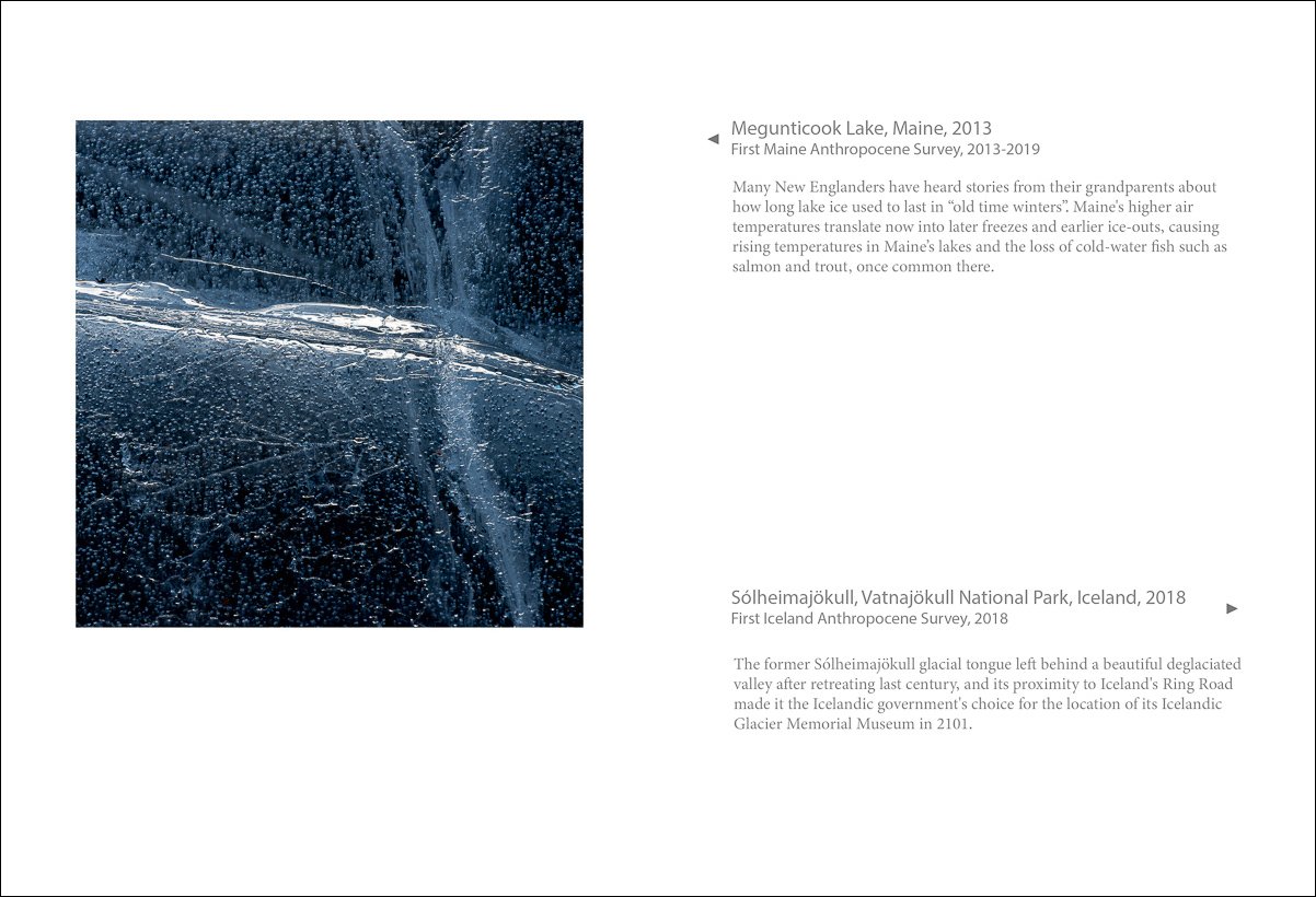
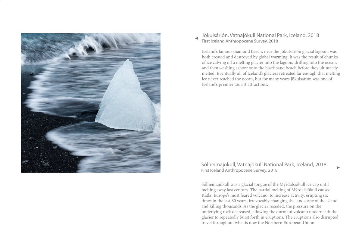
Jim Nickelson
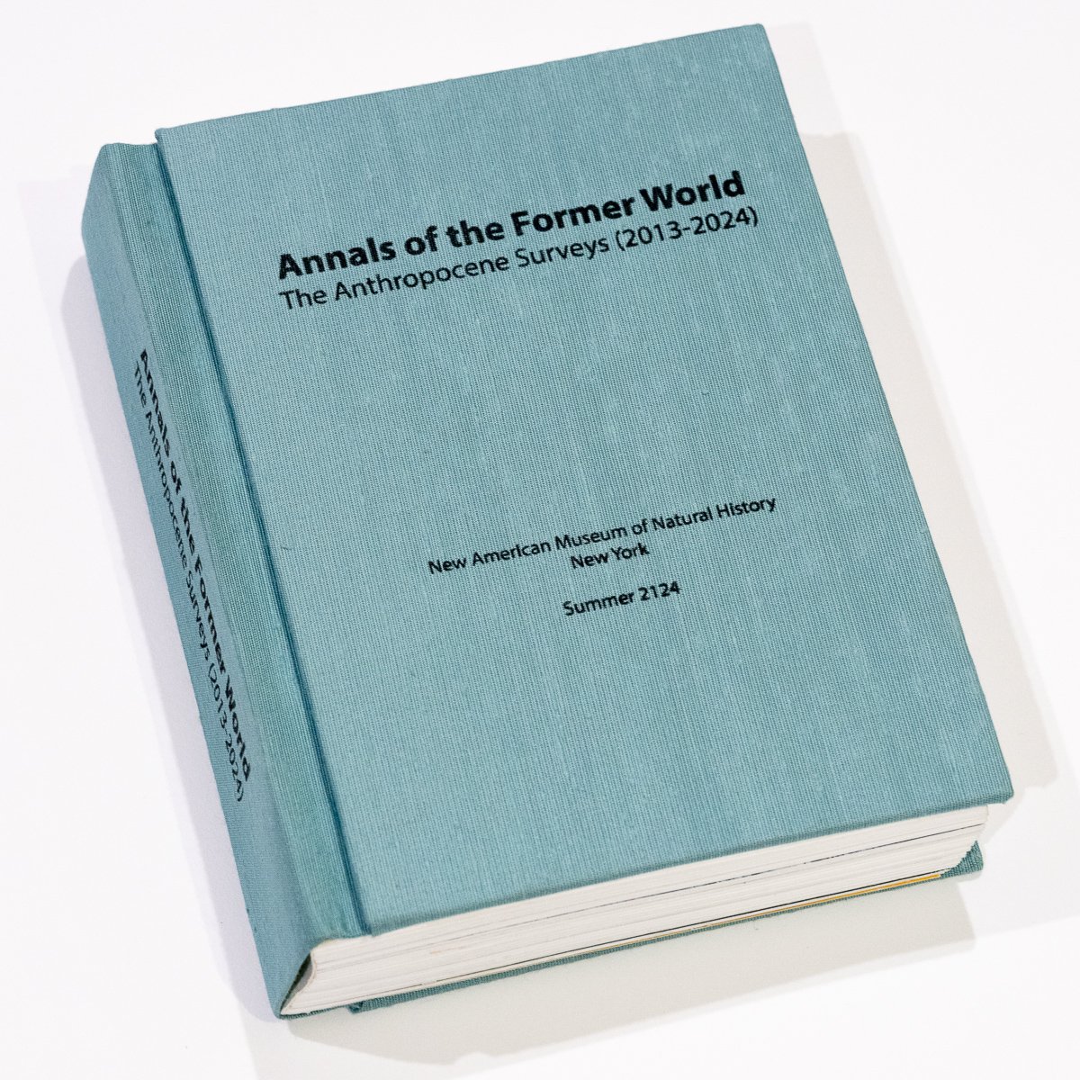
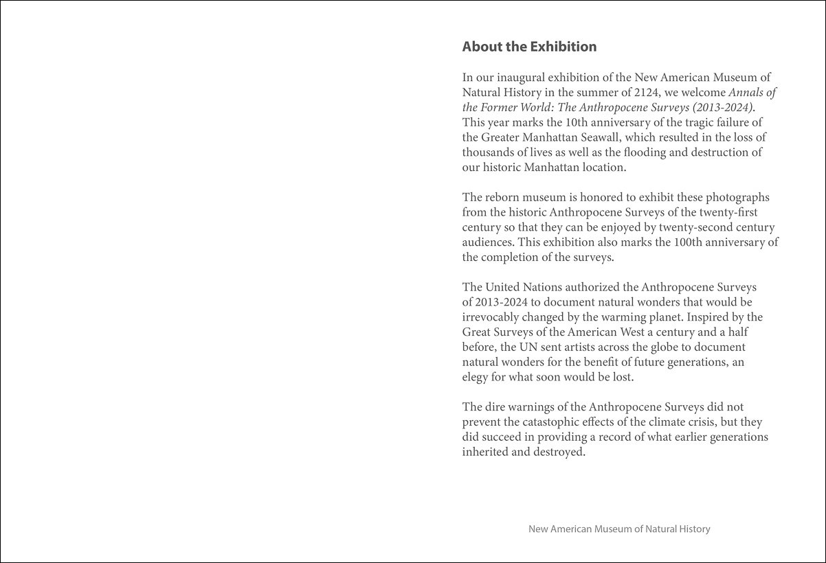
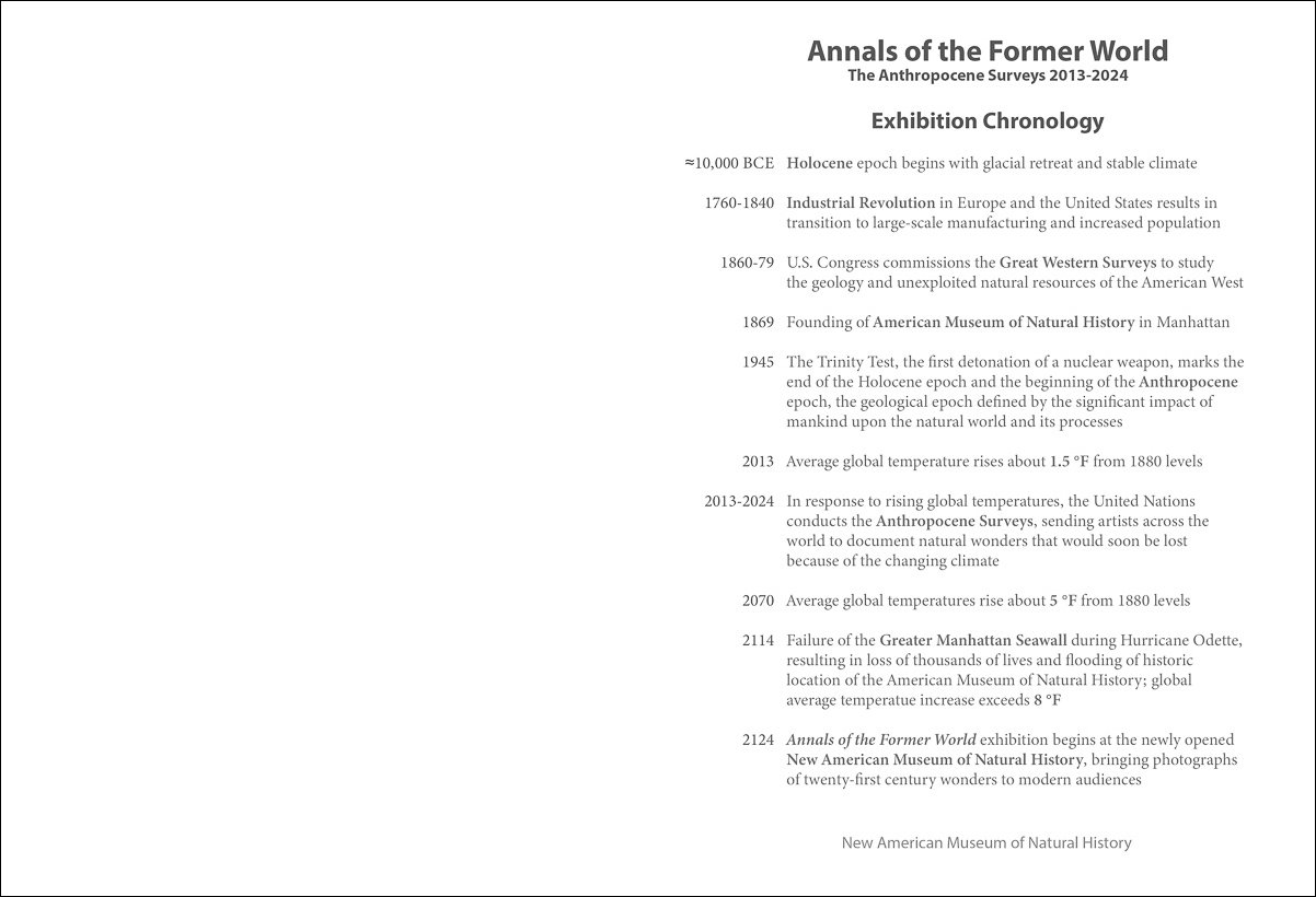
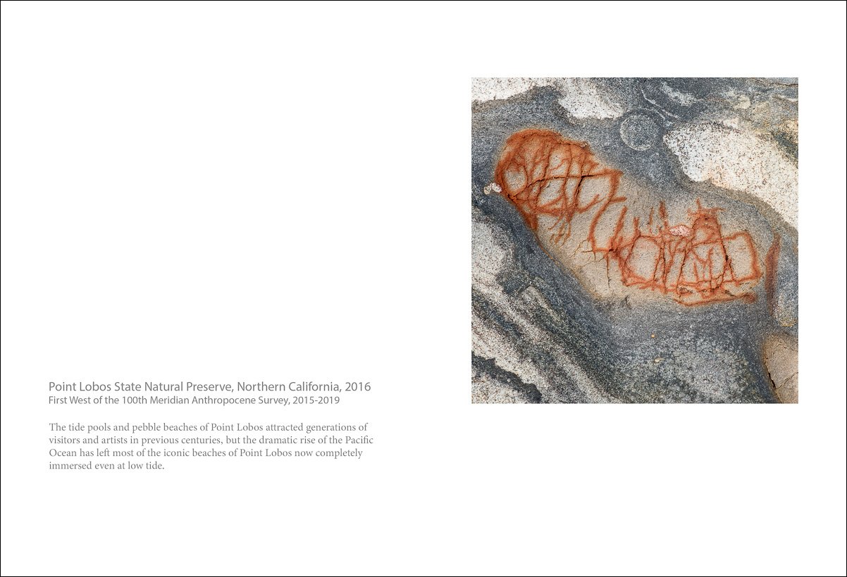
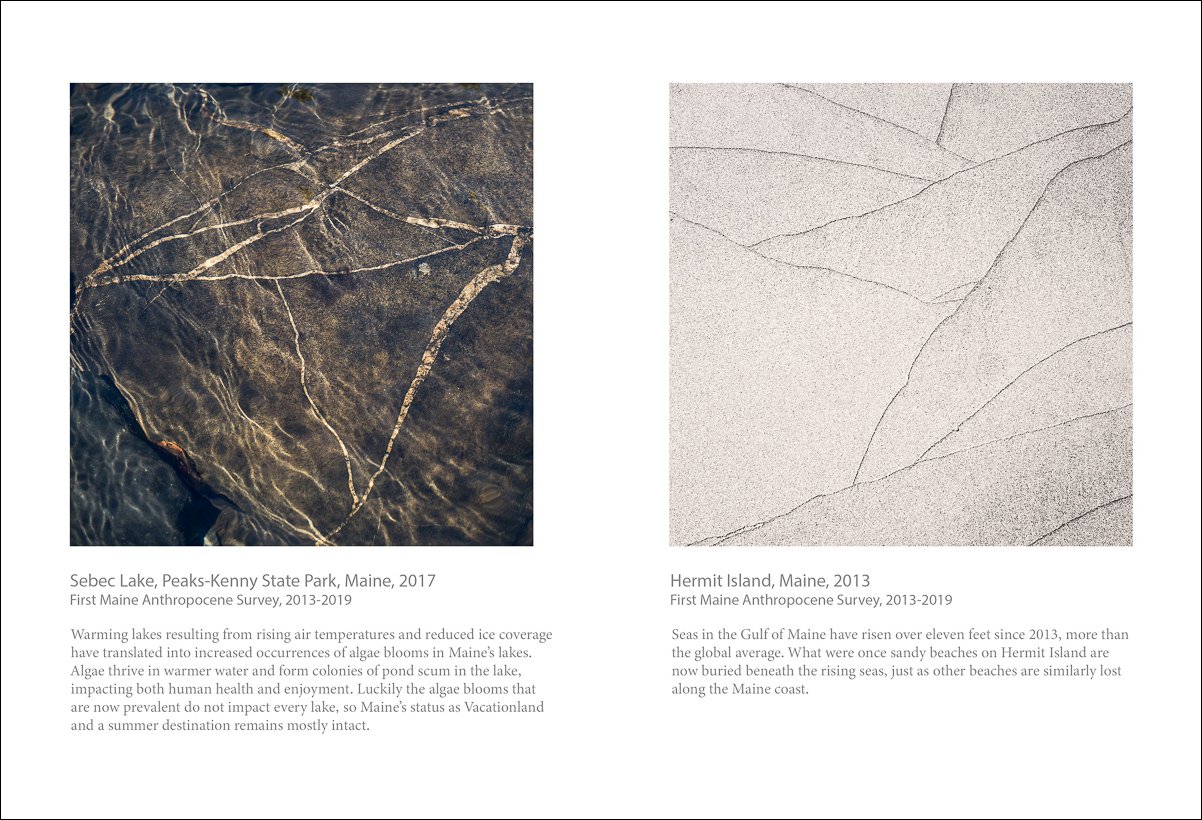
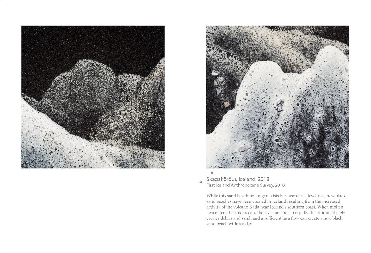
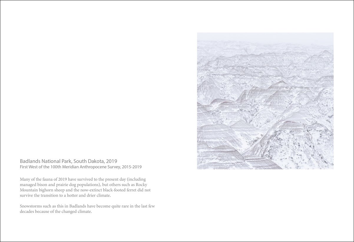
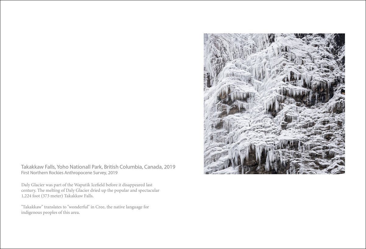
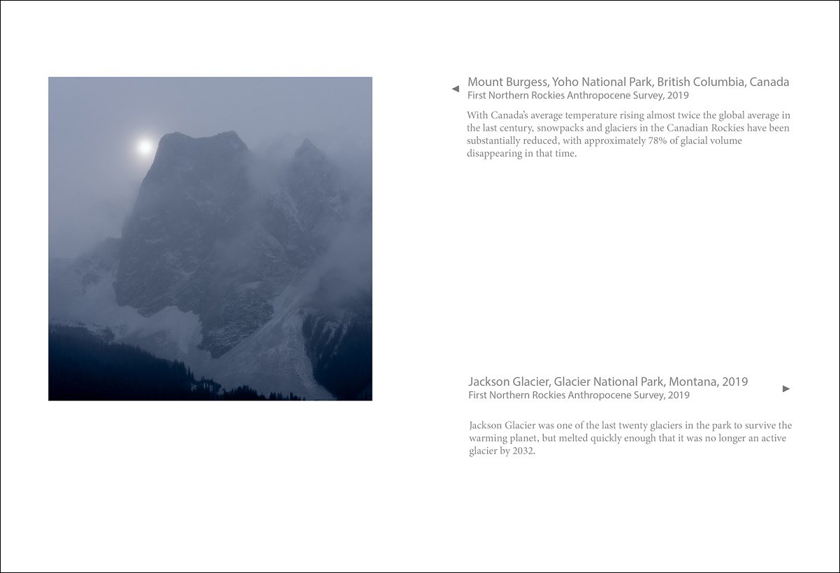
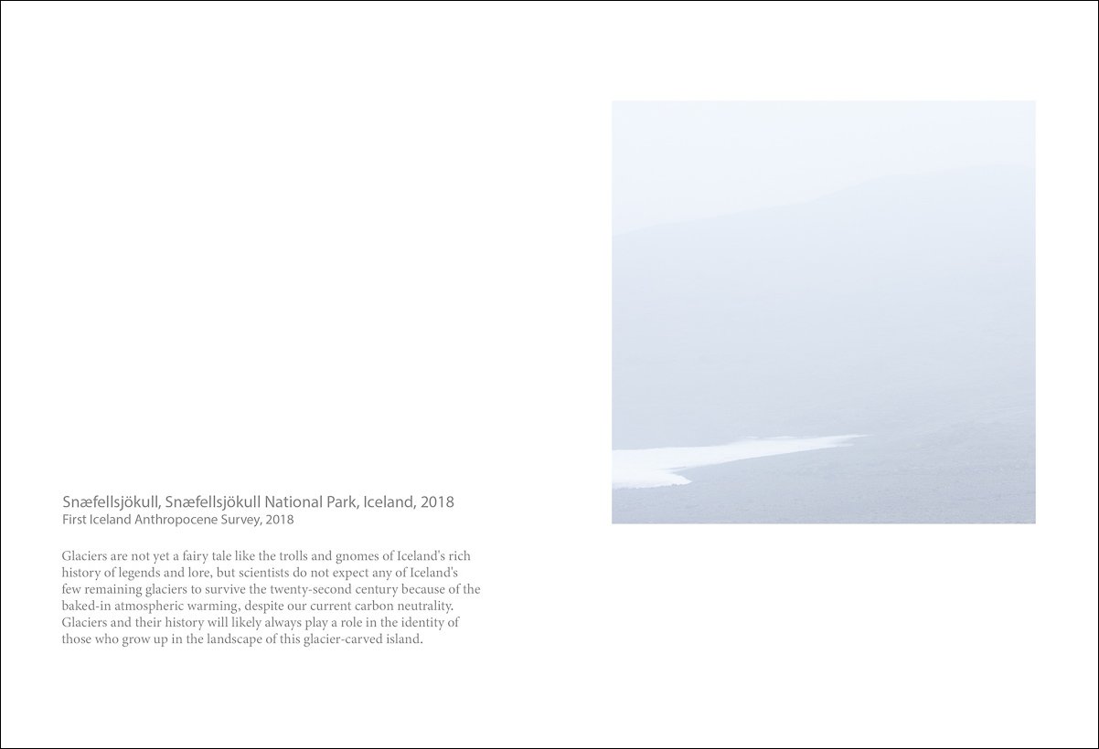
Annals of the Former World: The Anthropocene Surveys
Annals of the Former World: The Anthropocene Surveys is my testimony to the wonder of the natural world as we found it before irrevocably changing it via climate change, and serves as my record of this world for my own daughter and future generations, an elegy for a world that will never be the same. With Annals, I hope to increase awareness of what is at risk and to advocate for policies and actions on the part of governments as well as all citizens of the world to mitigate the threat as much as possible.
In this project, I have imagined a future history where photographers, inspired by the Great Surveys of the American West after the Civil War, conducted The Anthropocene Surveys to document what would soon be lost for the benefit of future generations. The handmade artist book is an imagined catalog for a museum exhibition entitled Annals of the Former World in the year 2124 that looks back to our current times and what we had and lost. JN

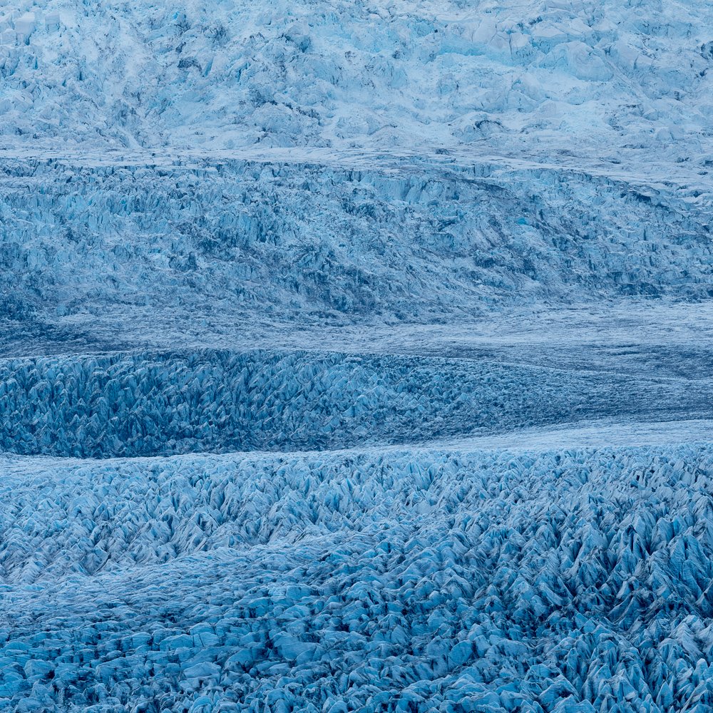
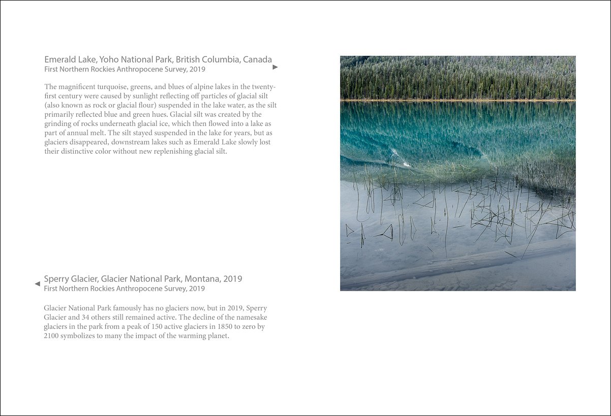
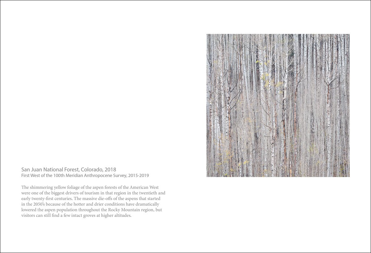
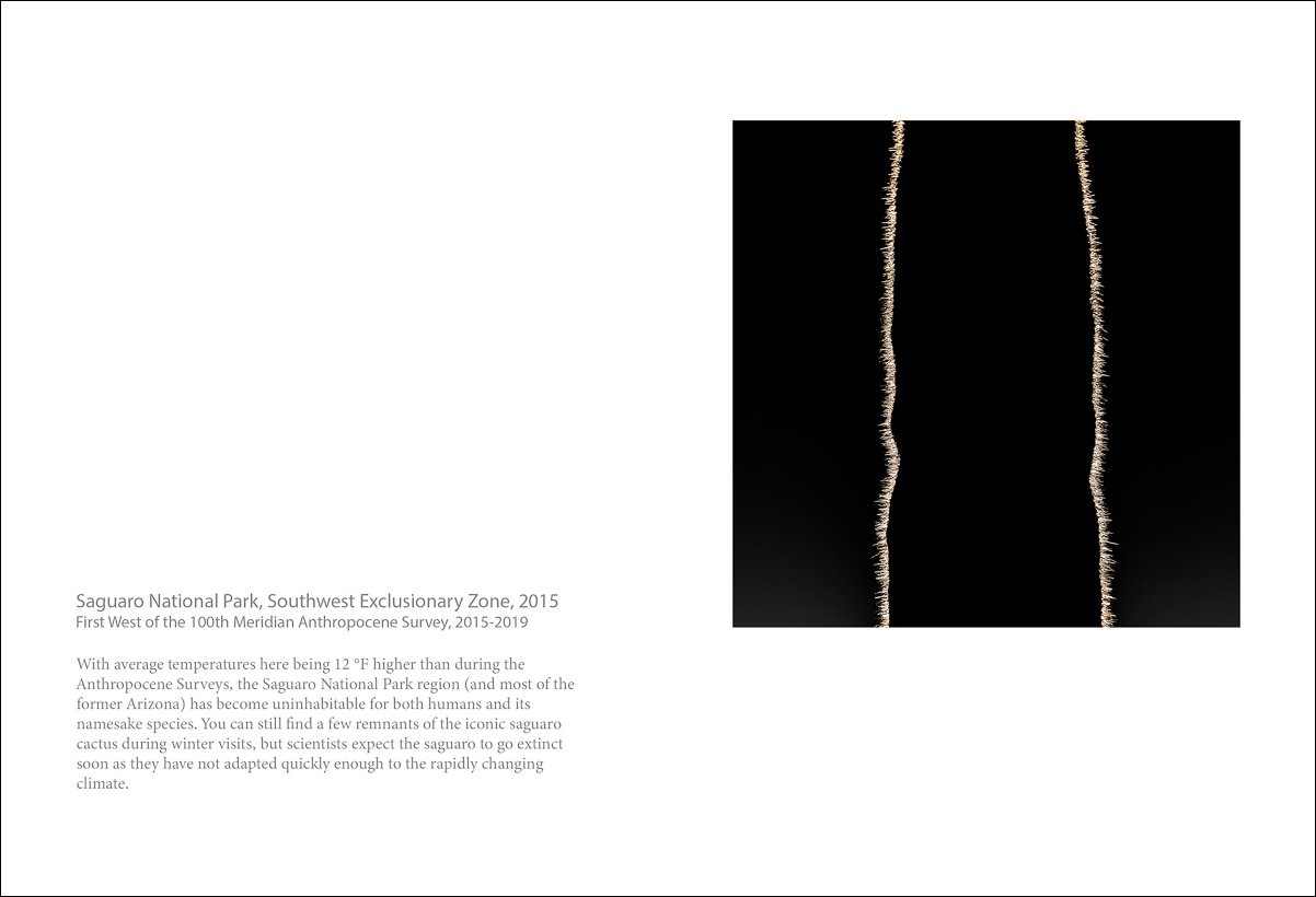
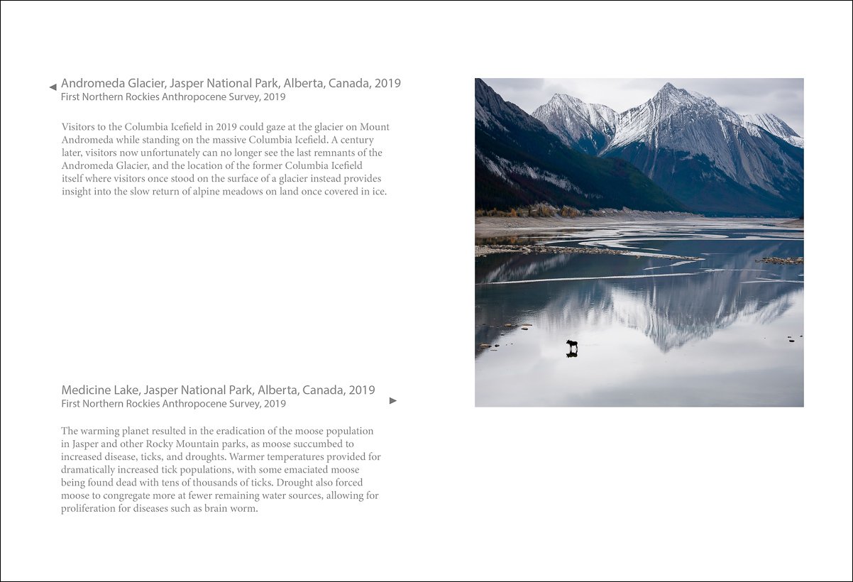
Jim Nickelson, Emerald Lake, Yoho National Park, British Columbia, Canada, 2019, Inkjet print, 30 x 30 in.
First Northern Rockies Anthropocene Survey, 2019
The magnificent turquoise, greens, and blues of alpine lakes in the twenty-first century were caused by sunlight reflecting off particles of glacial silt (also known as rock or glacial flour) suspended in the lake water, as the silt primarily reflected blue and green hues. Glacial silt was created by the grinding of rocks underneath glacial ice, which then flowed into a lake as part of annual melt. The silt stayed suspended in the lake for years, but as glaciers disappeared, downstream lakes such as Emerald Lake slowly lost their distinctive color without new replenishing glacial silt.
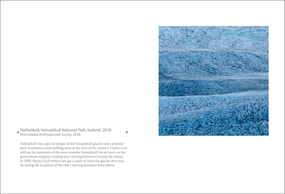
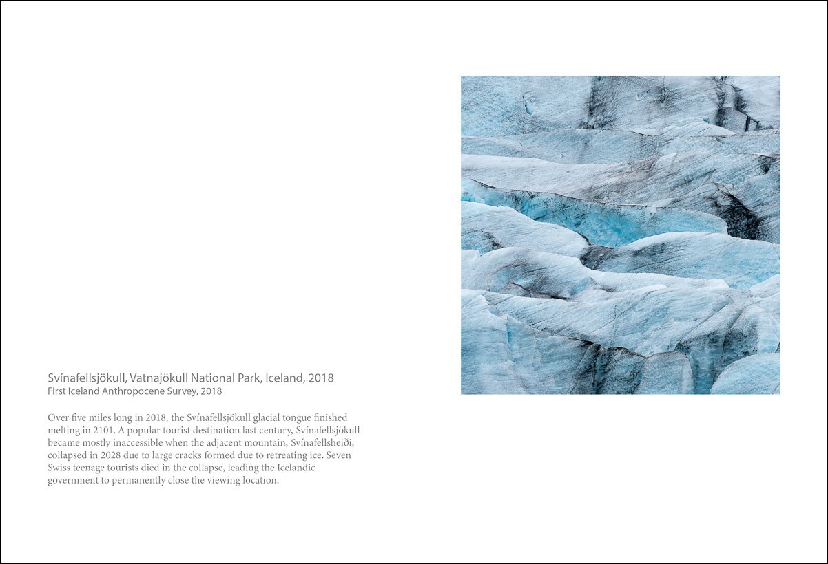
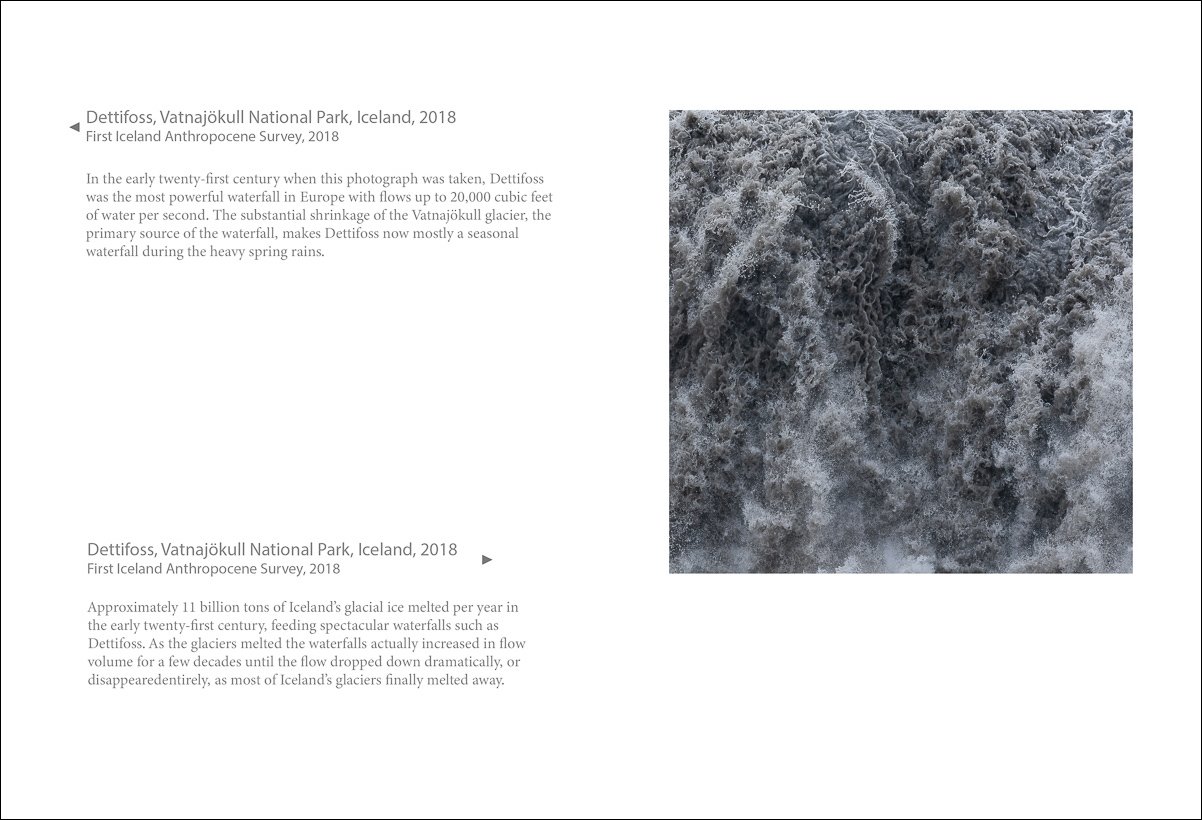
Jim Nickelson, Fjallsjokull, Vatnajökull National Park, Iceland, 2018, Inkjet print, 30 x 30 in.
First Iceland Anthropocene Survey, 2018
Fjallsjökull was a glacial tongue of the Vatnajökull glacier and a popular park destination until melting away at the turn of the century. Visitors can still see the remnants of the once-massive Vatnajökull via air tours, as the government stopped creating new viewing locations chasing the retreat in 2098. Sharp-eyed visitors can get a sense of what the glacier once was by noting the locations of the older viewing locations from above.


The Physical Book by Jim Nickelson
In late 2021 I published my first handmade artist’s book, Annals of the Former World: The Anthropocene Surveys (2013-2024). Completed as part of Book Artist-in-Residence program at Maine Media Workshops + College, the book features photographs from my project of the same name. JN
Purchase the book here.
A place belongs forever to whoever claims it hardest, remembers it most obsessively, wrenches it from itself, shapes it, renders it, loves it so radically that he remakes it in his image. - Joan Didion, The White Album (1979)

MMPA is proud to receive 20 prints from two portfolios; Timeline, Learning to See with My Eyes Closed and Our Time on Earth by Tom Young
These donations were made possible by Bill Press, Harry Brandler and Ralph Segall.
The sale of a photograph to Benefit MMPA
Noah Krell, The Hostess, 2007, Inkjet print, 27 x 32 inches, $1,500. Framed (tax free and includes shipping in the US) Noah Krell is a Portland based photographer, a master printer whose work is in many important collections. This images comes from a larger body of work called At Home made in 2007. There is only one available and the provenance is lofty and interesting.
We are hoping to sell this framed image by a local collector. It’s a win -win. MMPA will make 33% on the purchase. If you would like to view the Framed piece in person, or have a jpeg of the front and back, email us at, contact.mmpa@gmail.com
“We make a living by what we get. We make a life by what we give.” - Winston Churchill
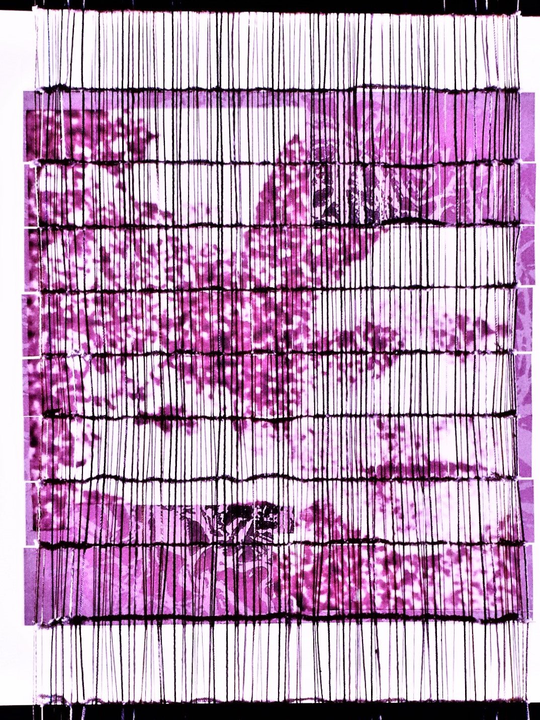
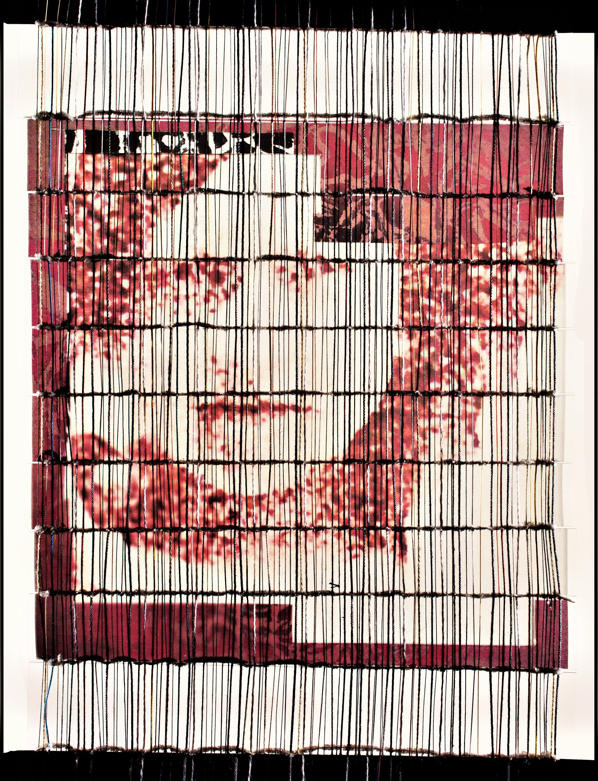
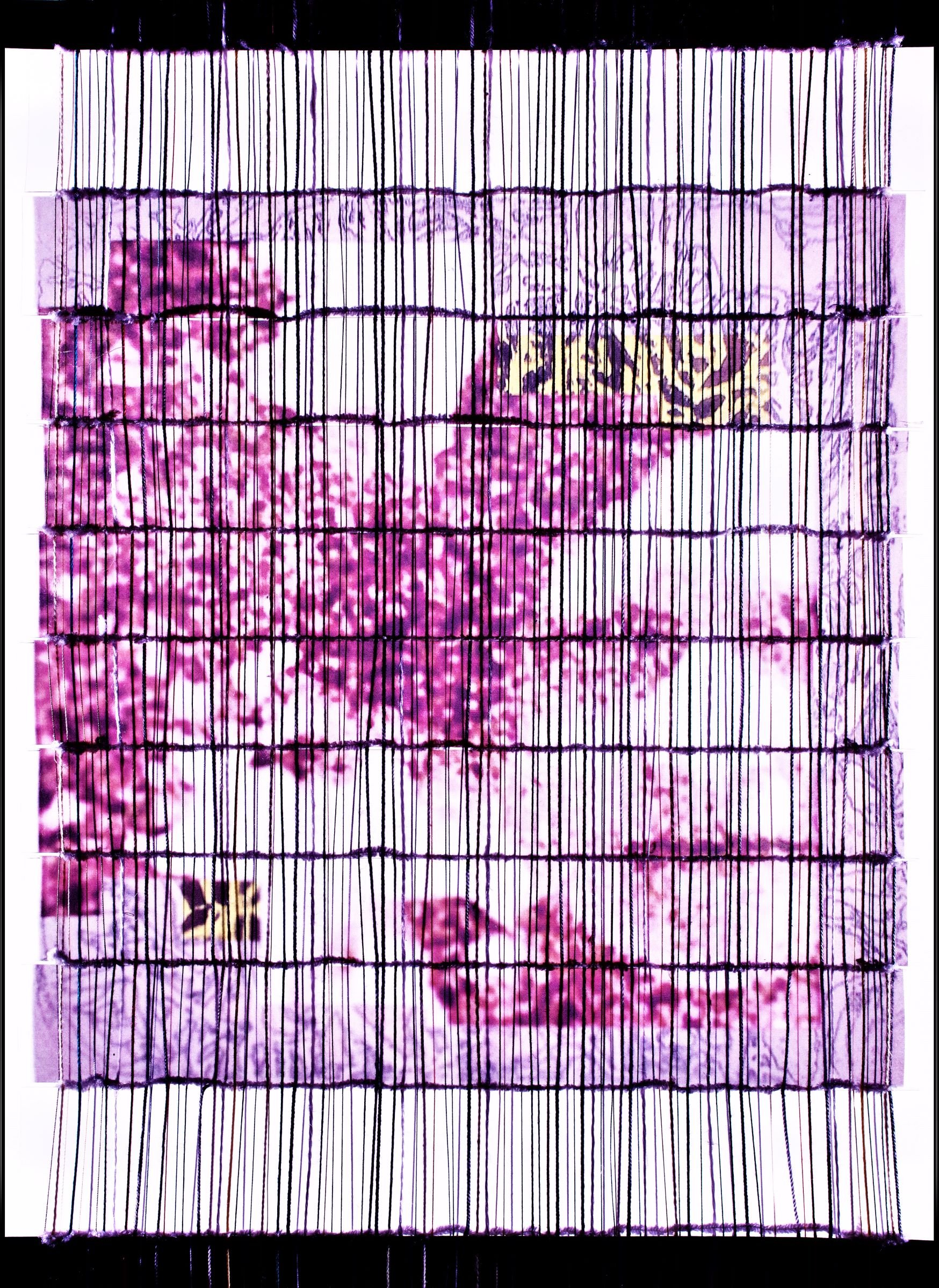
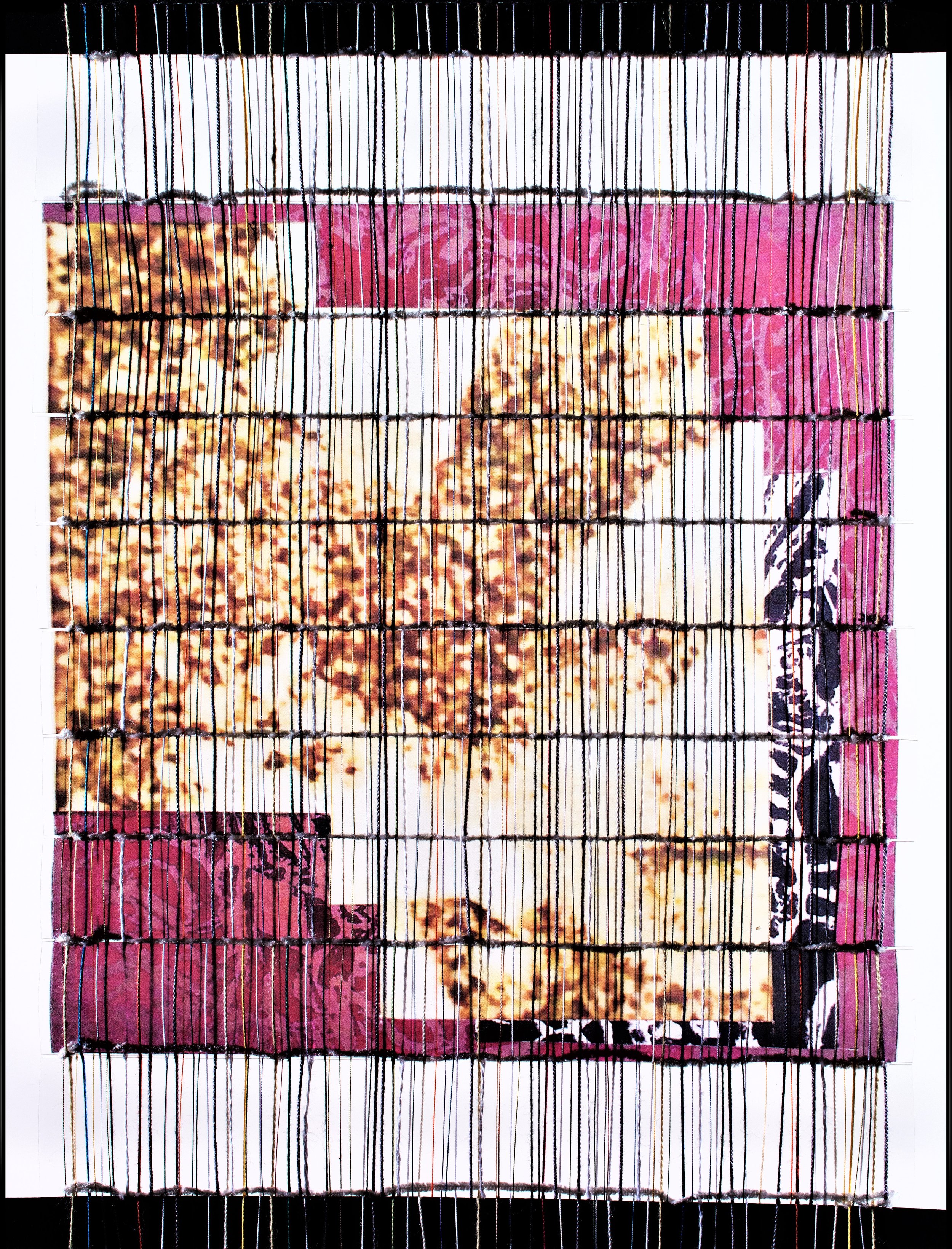
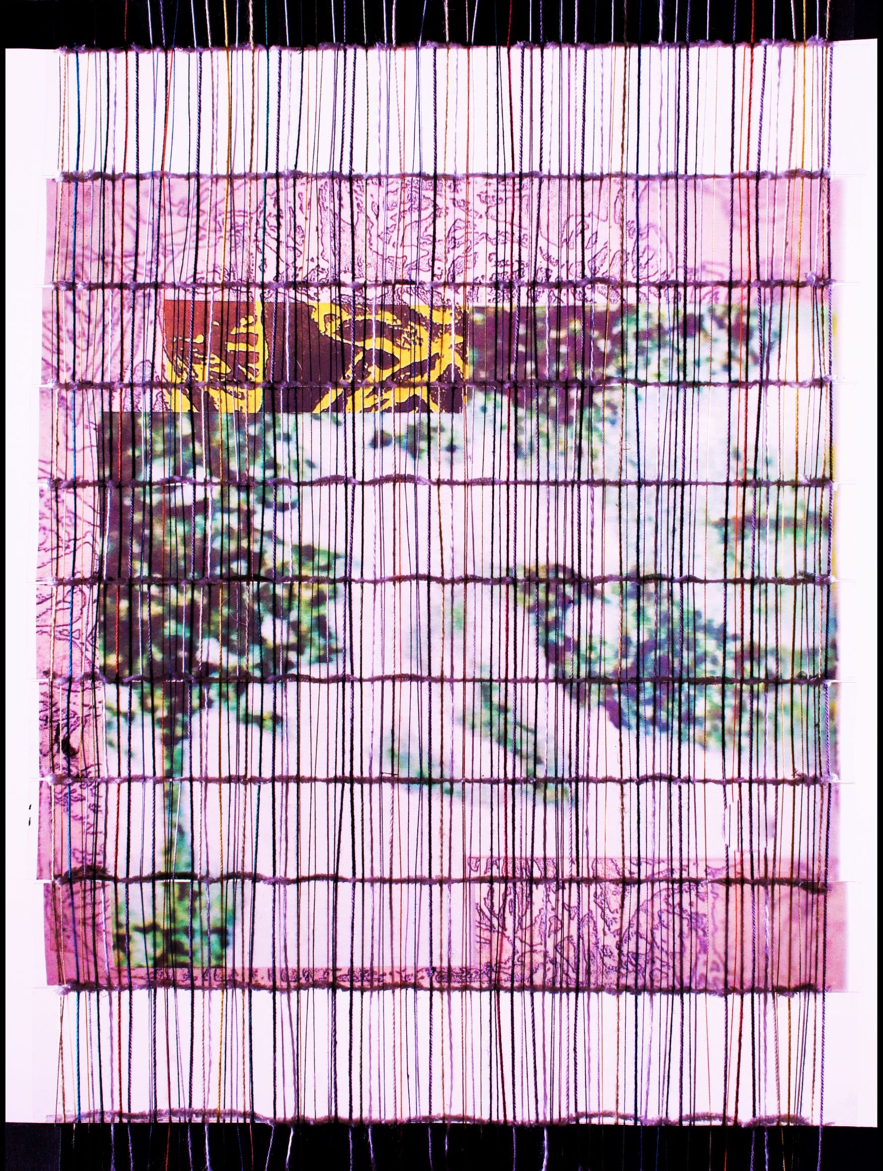
Gale Skudera’s A Walk in the Park series
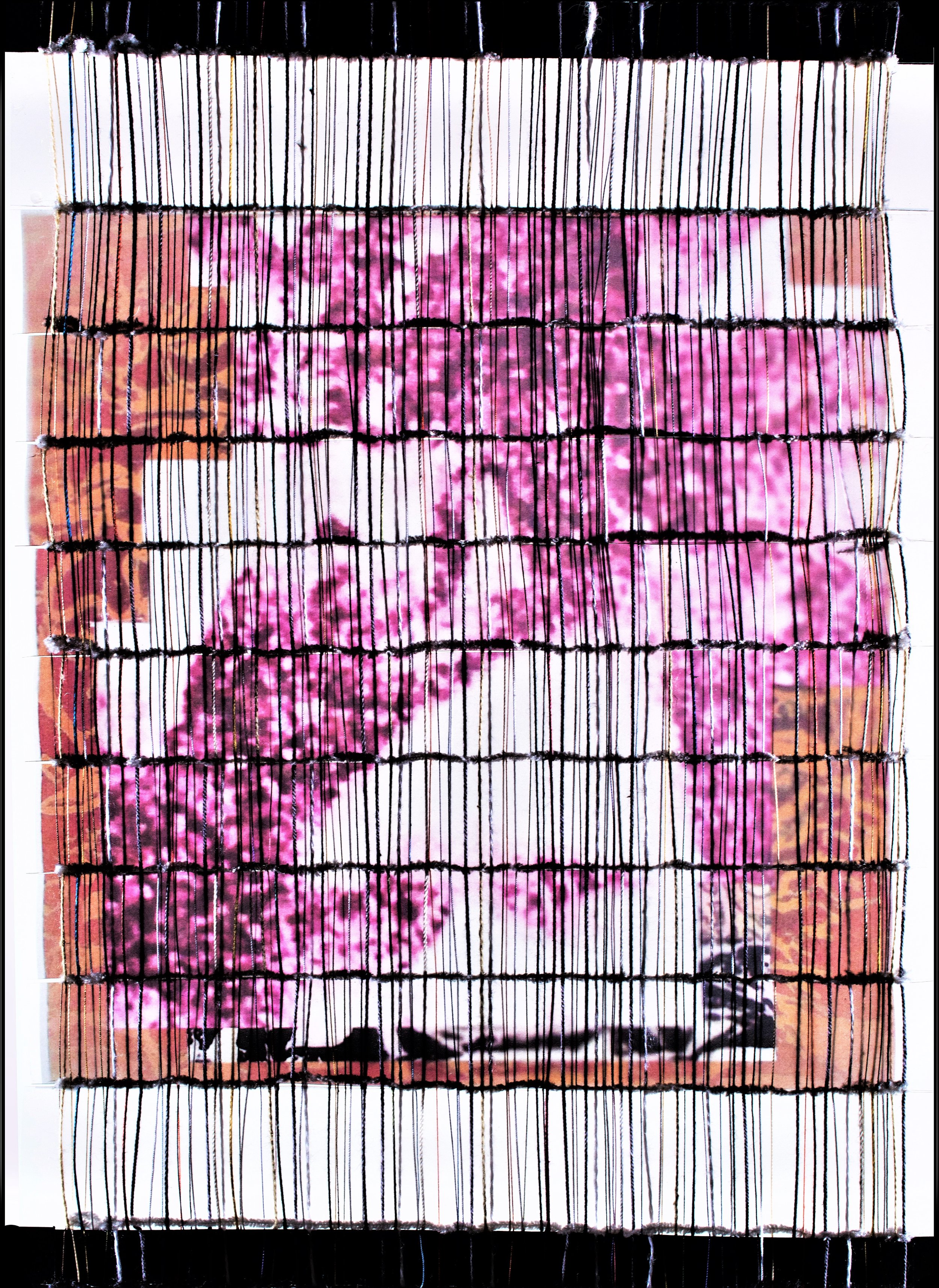
Gail Skudera, Gradient Passage, Panel 1, 2021, Film transparency, 12 x 9 inches
I am interested in how we see and what we see – by looking through the screen of a computer or an iPhone, and how that influences our perception. I combine different media in my works, taking imagery from vintage photographs and reworking them with different media in an attempt to restore meaning through content and form. This portrait series depicts a young girl in an outdoor setting, perhaps on a special occasion. Her expression transitions from an additive process of layering and screen photography so that while the form may be changed, the essence is not. GS
Gail Skudera, A Walk in the Park, 2021, Film transparency with paper, 7 feet x 14 inches (Please note the images below are panels from the larger construction above.)
C E Morse
The Farrago Series
"It's not what you look at that matters, it's what you see." - Henry David Thoreau

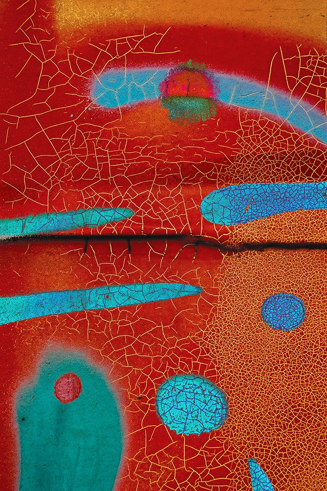
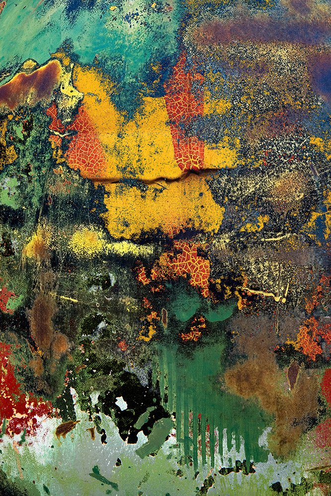
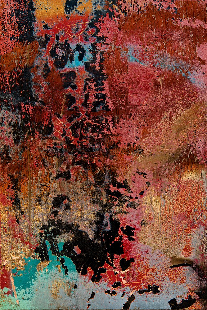
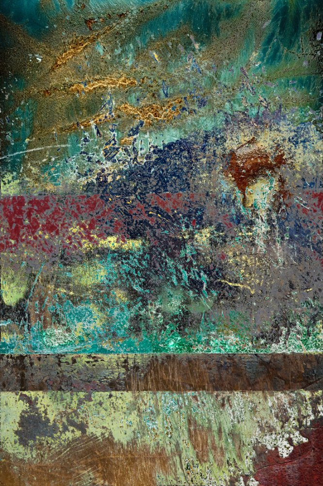
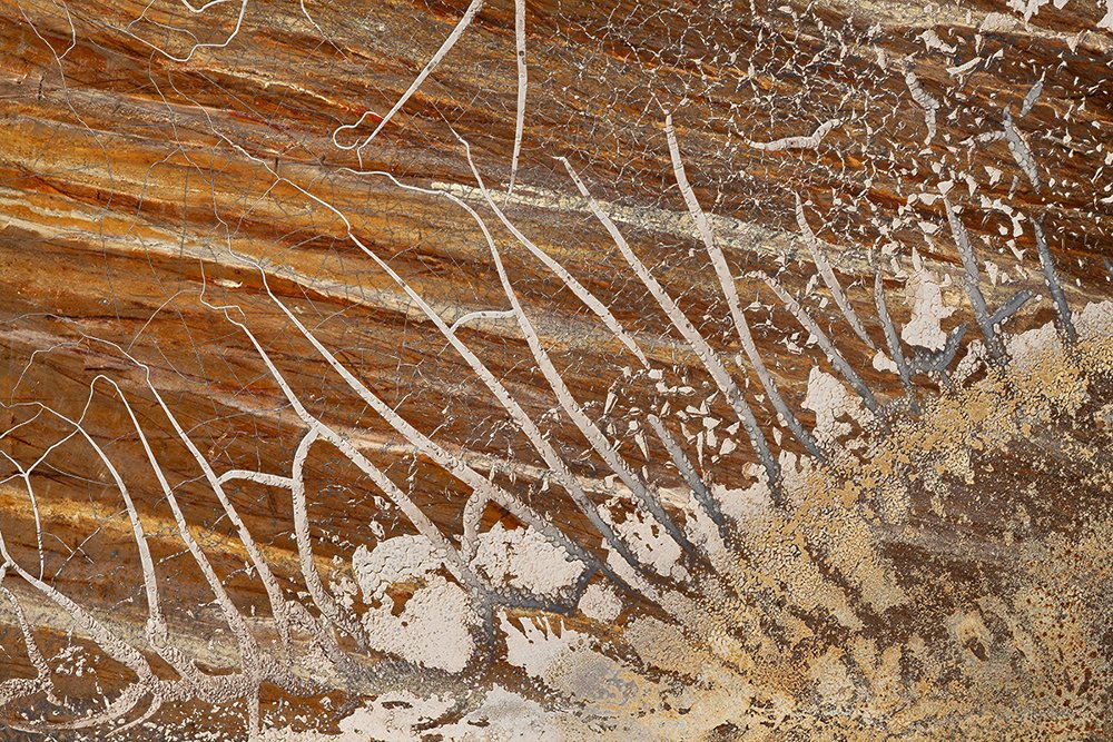
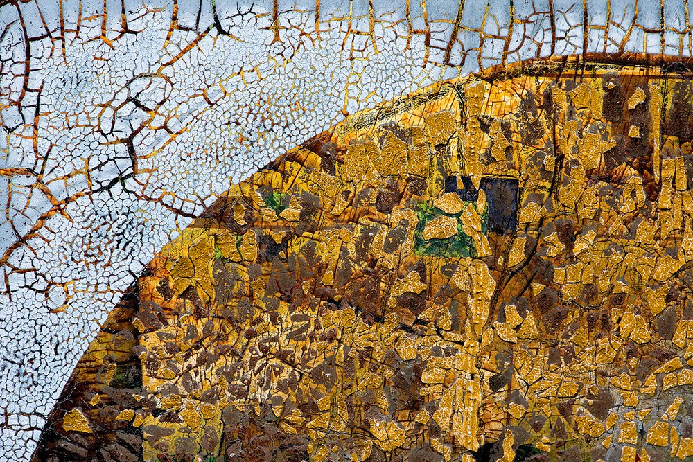
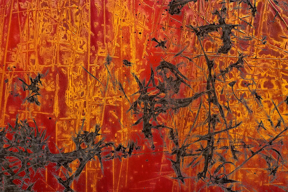
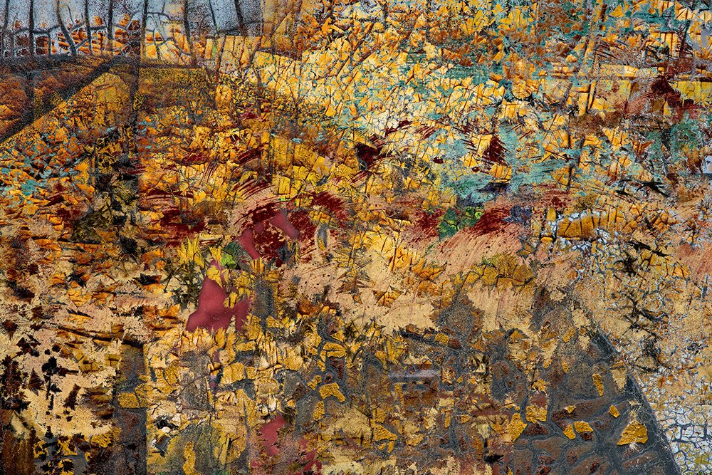
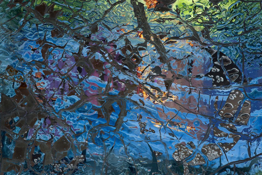
I spend a lot of time in vintage auto salvage yards and boatyards where I discover incredible visual elements that inspire me the same way as do the great abstract painters. I hunt for this wild art, looking for patterns, color, texture & composition in subjects both man-made and natural; embellished by chance and patinated by nature, with an unspoken history of random events that can only be guessed or imagined. There is no reference to the identity or the scale of what I photograph. The abstract imagery coaxes a personal interpretation contingent upon the viewer’s imagination. But lately I have been tweaking this idea a bit; morphing & blending abstract images; co-creating amalgamations of layers that are impossible in real life. The Farrago Series is comprised of images made by layering abstract details of found objects. The subjects of my original images are, themselves layered; their history exposed through deterioration, layers of paint, rust and patina. The Farrago Series takes the layering a step further combining rusty car fenders with boat hulls; dumpsters with broken glass, etc.. to create abstract images from improbable fusions of actual objects. CE
"Art is not what you see, but what you make others see.” - Edgar Degas
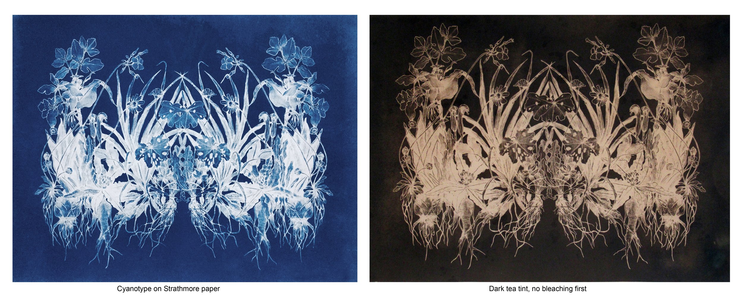
Judith Allen Efstathiou, Printmaker- on process
Last month the Peregrine Press had an exhibition at Cove Street Galleries celebrating their 30th anniversary. It was a great exhibit. Among some very impressive works were two stunning cyanotype prints by Judith Allen Efstathiou. Most of the work done by Peregrine Press artists consists of traditional printing processes such as mono prints and intaglio prints. Cyanotypes are a photographic process. But here, there were also non photographic steps involved. What we often see these days, in the direction photographic art is going, is the mixing of the photographic process with other processes. It is a direction often referred to as “Photo based art”. There was a need to investigate!
Judy Allen is an established artist living in Portland, Maine, for six months of the year. The other six months she lives in Athens, Greece. Her work has been widely exhibited both in the United States and Greece as well as in many other countries worldwide. Because of my fascination with her work and her process I asked her if she would do a “Process” piece for Antidote. - Jan Pieter v. Voorst v. Beest
My sculptures and works on paper stem from my love of walking in the Greek countryside and the Maine woods. My aim with these works is to bring the natural world into interior spaces. The series of cyanotypes and lithographs, Botanical Rhapsody, is based on drawings of wildflowers I make during my ritual walks along an ancient footpath on the Greek island of Kea. These drawings are in support of historic preservation of the island’s ancient network of mule trails and are my way of honoring and documenting one these footpaths. In my studio practice, I join digital photographs with more traditional drawing, printmaking and cyanotype techniques. Using the computer as my primary tool for manipulating my photographs and drawings, I reassemble images to print out as negatives for cyanotypes or as paper positives used for printing paper-matrix lithographs or as guides for cutting copper. JAE

Cyanotypes
Negatives/Positives
I make my negatives for cyanotypes either from my photographs or drawings.
I work on the images in Photoshop changing images to BW and reversing the image (image – rotate – flip horizontally)
If I want a positive image in the cyanotype I invert the images to make a negative (for negative images I use a positive with no invert).
I print my negatives (or positive) with a BW laser printer using UV paper, like Delta Film, or on a clear transparency. For larger than 11 x17 images I have my digital files printed either on a UV film at Am-at-Ure Services on Oxford Street in Portland. Or I have them print on photocopy paper that I oil with mineral oil.

Cyanotype solution:
In a darkroom with a safe light, mix the 2-part solution 1/1. I use Photographers’ Formulary ordered from B&H photo NY.
I mix just the amount I will use that day as it starts to degrade a day or so after mixing.
Shake the bottles before mixing as some chemicals settle to the bottom.
If there is any fungus growth in the chemicals, pour it through a coffee filter
Keep in a light proof container and use it within a day or 2.
Coating the paper:
In a darkroom with a safe light I coat paper (or cloth) with a Japanese brush, keeping application as even as possible – don’t glop emulsion. Brush off excess. Coating is yellow or slightly greenish
Let the paper dry flat in a darkroom or a light-safe box for at least 1-2 hour (overnight is best, use within 3 days). After the paper is bone dry it’s ready for exposure. Try not to touch the emulsion-coated surface.
For mulberry paper or linen, I put the good side face down on plexiglas brush on the cyanotype liquid on the back until it saturates the cloth or paper. I let it dry face down.
For heaver papers like Reeves BFK, or Strathmore paper, I paint the cyanotype liquid on the front of the paper being very careful not to get any liquid on the back. Depending on the paper, 2 coats may be needed while the paper is still wet.
Expose In a UV light unit:
I use the light unit at Peregrine Press that takes up to 28 x 36 (it’s also used for screen printing). The exposures for cyanotypes are much longer than screen prints. The unit doesn’t need to be heated up first, but some other types of light units need to be warm up for 20 minutes.
I clean the glass surface very well and place the negative face up on the light unit and the coated paper face down on the negative – set the time. The vacuum comes on automatically during exposure.
For clear transparency expose 3 min. for UV paper or oiled photocopies 6 – 9 minutes (exposure time is longer for a really dense negative). I do test strips to decide on exposure –longer time = darker blue color.

I use direct sun only for negatives too big for our light unit
Best in full sunlight with the paper and negative sandwiched between glass (loaded in a darkroom).
Exposure: between 10 – 20 minutes full sun depending on the season/month.
Developing the print
I Drop the print into a tray of water face down and agitate (you can add a bit of vinegar to the water for darker prints). I don’t ever touch the surface or let the water sit still: emulsion will pool and stain your highlights. Keep agitating until the print has turned completely blue, allowing the water to fully penetrate the paper fibers.
Leave in the try with water running for 5 min. or so. This clears out the last of the chemicals left over by the development process. Be careful when picking up the prints: a wet cyanotype will smear emulsion if you touch it. Once the print dries and hardens, rewetting will not result in more smears.
Let dry in full light, the print will continue to develop for an hour or so to a darker blue color

Bleaching Cyanotypes: The purpose of bleaching is to help break down the iron so that the tannin in the toner can “grab on” easily or simply to lighten the blue color. If you bleach too far, you lose shadow density in toning. If you bleach too little, your shadows will stay a blue shade. If your print turns a bright purple the second you place it in the solution, it’s too strong.
Age your prints at least 24 hours for the emulsion to harden.
Pre-wet your prints in water to allow the solutions to penetrate the paper fibers evenly.
Bleaching agent: Sodium Carbonate (washing soda) 1 tsp. added to 1.5 liters water.
Pull the print out a few seconds before you think it’s ready – the print will continue to bleach a bit while you start to rinse it.
Always rinse the print well in running water between the bleach phase and the toning phase.

The Toning a cyanotype: I only use tea for toning, but you can experiment with other things like coffee.
Brewed tea for about 10 minutes in 250 mL of hot water, then added to a 1.5 Liter of room temperature water (about 8-10 small tea bags). Use teas with tannin in them like black tea or green tea –Green tea produces an eggplant/black shadow, and is so mild that it doesn’t stain the paper base too badly. Black tea will stain your paper the most, but it produces a lovely warm black/brown shade that’s nearly impossible to get anywhere else. Earl Grey tea: doesn’t work! – It has a lot of oils in it that can damage your print.
Tea toners work really well with a minimum of bleaching, tone prints in tea for about 2 hours, but depending on the print, it can take up to 8 hours.
Some people suggest that tea should be hot for a faster toning but stains the paper more.
After toning, it’s a good idea to let the print sit in water for about 10 minutes before the final rinse to help remove some of the excess tannin. All tea toners should be used freshly brewed – they lose potency after a day and should not be reused.
Troubleshooting
Entire print washed off in the developer, You didn’t expose long enough for the image to fix. Or the emulsion wasn’t completely dry or the emulsion was very old.
Print looks washed out Different papers will produce different color tones of blue– avoid cheap art papers because they will have more chemicals in them that interact with your emulsion. Also try double coating for deeper shadows.
Cyanotype prints may fade over time. Cyanotypes like a slightly acidic environment, and sun will fade the print. I haven’t had any prints fade but I’ve heard you can put a faded print into a dark closet and it should come back to its normal color.


I start a book and I want to make it perfect, want it to turn every color, want it to be the world. Ten pages in, I've already blown it, limited it, made it less, marred it. That's very discouraging. I hate the book at that point.
— Joan Didion
An Interview with Dave Kirkwood, Local Historian aT the Portland Camera club
Dave Kirkwood is a retired public relations manager from New Jersey who came to Maine about 24 years ago. He is an enthusiastic photographer, and was involved with a Camera Club in New Jersey for about six years before coming to Portland, Maine. Once in Portland he became an active member of the Portland Camera Club and over the years of his membership has become the “Historian of the Portland Camera Club”, one of the oldest Camera Clubs in the country. Currently he is working on the history of the first 100 years of the club. Jan Pieter caught up with David and interviewed him about the history of the club, the role of Pictorialism and the role of women in the club.
Jan Pieter: The Portland Camera Club, one of the oldest camera clubs in the country, was founded in 1899. What can you tell us about those early days and their relationship with the Portland Museum of Art?
Dave: In a capsule, the early relationship was somewhat distant but friendly. But to add a few more details, it had some ups and downs. It took nine years before the Art Society, which was the organization that ran the museum, to invite the club to merge. The purpose was to bring together two aspects of art: The Society was mostly artists, and the club offered knowledge the painters lacked. The reason for the Society’s lag time was whether the new club was stable enough. An earlier club lasted only about four years. The present club’s history was little better. It had grown to 100 members in eight months, but by 1902 had fallen to 50. Stability came only when they finally found rental quarters in 1903.
It took five more years for the society to be certain. In the meantime, the two groups were friendly, sometimes loaning the other use of its rooms, and in one instance the club made the Society’s president an honorary member but it took almost three years to iron out the details which were dependent on a large inheritance received by the Society. The Camera Club was located on the third floor of the Society’s newly inherited house. Behind this merger was the spirit of generous feelings harbored by the Society towards photography. Photography was not considered an art by many people in the arts community; clearly, the Society felt differently. There were two big disagreements between the two in the next ten years. I’ll save the one about women for later because I know you want to explore that subject further. The first started in 1914 over an art class for “life studies”. The Society wanted to use part of the club’s third floor. “Horrors!” cried the club’s board. “Nudes in our sacred male sanctum!” (I’m paraphrasing.) They delayed a rude six weeks to reply, but they eventually caved in. The request, though, had been by the son of John Calvin Stevens, and apparently festered in Papa’s mind. In 1920, and Stevens, who was Society president, openly accused the club of being of no value to the Art Society. The club board was livid, and one club member wanted to challenge Stevens to a duel. It was all papered over.
Jan Pieter; Of course the Old Camera Clubs were all strictly adhering to the rules of Pictorialism , dictated by Alfred Stieglitz, his magazine Camera Work and the work that he showed in “The Little Galleries” in New York. Was there a time that the influence of Pictorialism had in camera clubs diminished and what took its place?
Dave: Yes and no. How’s that for a definite answer? Actually you have come up with a very complicated question, but I’ll make a try of it. Current evidence is that virtually all camera clubs favored Pictorialism. Pictorialists were most prominent from about 1890 until 1920, although one author places their decline as early as 1907. The Portland Camera Club was a pictorialist club from the get go because some of the founders and early members were pictorialists and it stayed that way for years. Out in the photographic world the “straights” were slowly gaining adherents and the 1920’s were a time of conflict—and insults. By 1920 almost all serious art photographers were straights. By 1940, Pictorialistm was all but dead in the professional world except in the camera clubs—they kept the faith. My guess is that Portland was one of the clubs that held on longest. It was still teaching pictoral subjects such as bromoil processing into the 1960’s. But it was on the famous slippery slope. The entire rest of the world went “straight”. How did the club members adapt? They went with the flow. The only alternative was “straight”. They all became “straights”, some gradually, some went kicking and screaming. In my 24 years with the club I never heard pictorial mentioned.
The last “official” mention of Pictorialism I have encountered was in a 1992 copy of a New England Camera Club Council bulletin, when the editor tried to define for his readers the two categories in club competitions. It took three paragraphs to define “Nature”. The other “Pictorial”, needed only two words: “Everything else” The word was now empty of meaning.
Jan Pieter: Over time there have been many changes the camera club had to adopt: New formats and technologies, transition from slide film to digital, removal of the old darkroom, cellphones... However there now seems to be a movement in photography, going back and experimenting with alternative (older) photographic techniques. Do you see that happening in camera clubs? What direction do you see camera clubs going?
Dave: Now I really wish I had not dropped my crystal ball last week. Let’s take them one at the time. I doubt very much that camera clubs will do anything with older techniques. It is too much of a niche interest and camera clubbers are usually enthralled by any NEW equipment. Retro technologies are not in their wheelhouses. I can see enthusiasts in larger cities getting together as a club or under the wing of a school or a museum. As far as a significant revival, no. Where would we put the dark room? Would anyone want to go back to chemicals?
As far as the direction camera clubs are likely to take, that may be decided by a nasty little fellow called “Corona Virus”. It will probably damage some clubs, and some so severely that they will not emerge alive. Here is a parallel example: Whenever the camera club moved to a new location (it has moved six times), some members took the opportunity to skedaddle, sometimes a lot of them. If a club can’t meet for a period of time it is likely to give a number of “itchy” members the psychological chance to take a walk, or to develop other interests.
All this is pretty grim, sorry. If things do come out well with the virus, my guess is that the clubs will revert to their old ways of doing things. Inertia is a powerful force, and it will be doubled by people wanting to just get back to normal. That’s not necessarily good. When things are disrupted, that’s an opportunity to take stock and a new look—and check out possibilities.

Francis Orville Libby, Tall tree trunks, 1922, Gum print, 13.5 x 10 inches, Gift of Portland Camera Club to the MMPA Collection
Jan Pieter: Do you see comparisons between the old pictorial way of adhering strictly to the rules of composition and the current judging (PSA) rules camera clubs now use in their competitions? Do you feel that the work shown in Camera Clubs today could be classified as “Pictorial”?
Dave: Let’s take the second question first. Absolutely, it can and should be! One hundred years ago there were two styles of photography, ”Pictorial” which was based on manipulating the print, and “Straight” which was based solely on what the camera gave you. Their advocates’ goal was the same: To get photography accepted as a fine art. However, their approaches were diametrically opposed and they came to despise each other. Ultimately, the straights won completely. Pictorialists lay in a coma for fifty years, and everyone today is a straight, but only in STYLE! The digital revolution revived pictorialism stronger than ever, and now the modern day METHOD of manipulating the image, which is straight (oops- pardon the pun) out of pictorialism’s playbook, has been accepted by everyone. This new hybrid way of making a photograph has no name… The two antagonists have merged, but it is Pictotialism’s way to create an image that’s dominant, and no one sees it for what it is. We are all pictorialists, sitting at a computer, perfecting our images long after the camera took the picture. We don’t manipulate anymore, we do “Post Processing”. It’s a common phrase to hear:” Don’t worry, we can fix it in Photoshop.
As to the first question: It seems so me that the situation has improved significantly. For quite a while in the twentieth century one of the major criteria in valuing a picture was its “Pictorial Qualities”. This was a straight jacket on creativity and improvement since it had the effect of forcing an ideological framework on the photographer. Having to judge a photograph is a terrible job to have to perform since, even within specific criteria, it’s an art in itself. The camera club’s current 12 point system used by the pros seems better than any of the many it’s had in the past, and it’s still flawed.
Jan Pieter: What is the story of women in the Portland Camera Club and when were they first admitted?
Dave: Why don’t you give me questions that I can answer with a simple “Yes” or “No” ? This is a little complicated because there were actually two “first women”. Women were invited, actually encouraged to, join the club from it’s very start in 1899. Back in that day, that attitude was highly unusual. Four women joined at the first meeting, three more at the following meeting and it was eight by the end of the year. There are hints in the board meeting minutes that some men did not want women in the club, no women were mentioned from 1906 until1934.
In 1910, when joining the Art Society the club made it official “Male only” without any preliminary indications. Three years later this rule was reversed, probably at the request (order?) of the Art Society.
Some club members fought this reversal tooth and nail, but lost. It did not matter, no women are mentioned in the records in the next 24 years. There is no record as to how this de facto discrimination was accomplished
In 1925 someone (not named) proposed a ladies auxiliary. It went nowhere. Nine years later a professional photographer named Ethel Wight sought membership. She was the second “first woman”. After a fight that lasted about four months she joined, but the records are missing. In fact, they were destroyed but in such a clumsy way as to show that there was a deliberate cover up. Oddly, Wight was elected the projection director only four months after joining.
More women joined in the next few months. They began receiving responsible positions within two years and the first woman president was elected in 1956. There have been several more, but far fewer than men. Right now, everything seems fine to me. But you might want to check that view with some of the women members.
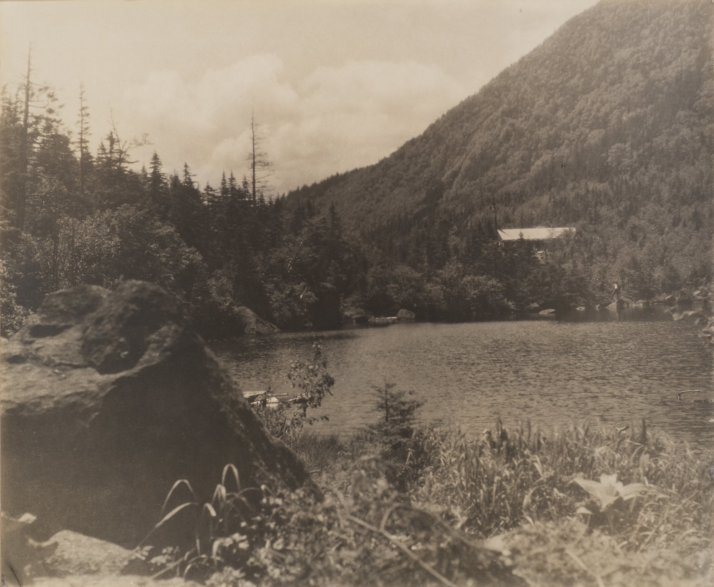
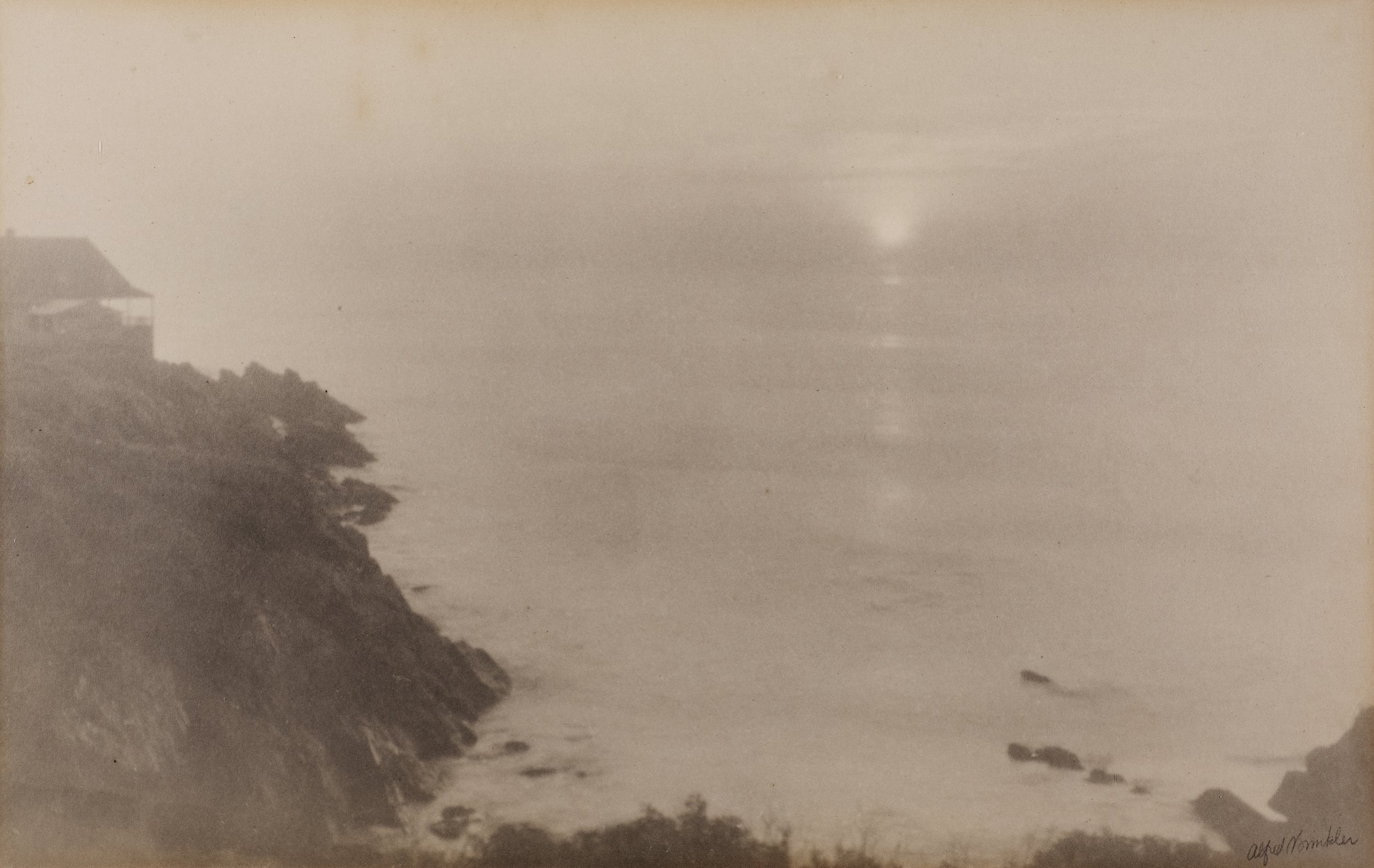
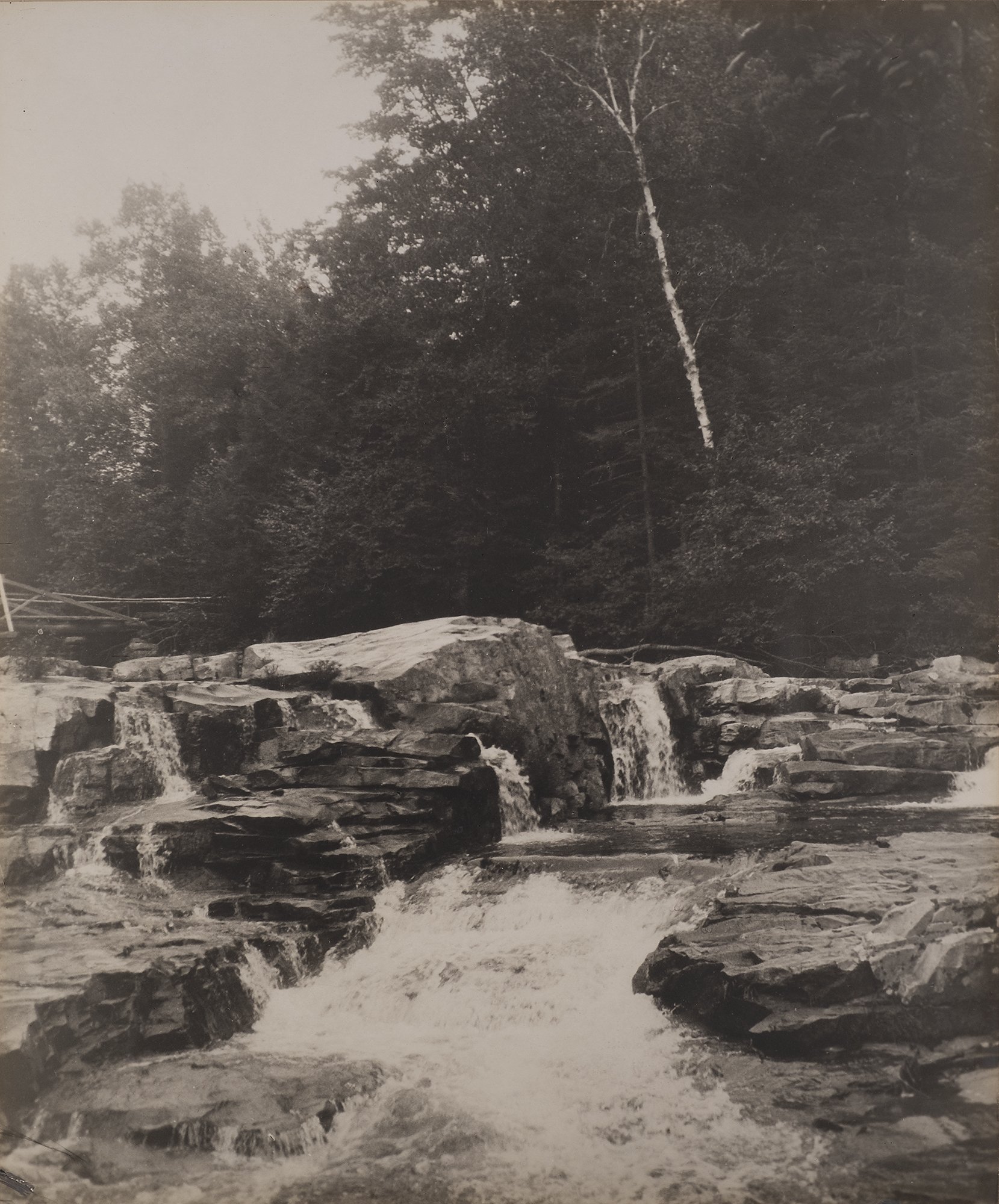
Jan Pieter: The club recently donated many photographs of their historic print collection to the Maine Museum of Photographic Arts. This was mostly work by the club’s early pictorialists Alfred Brinkler and Francis Orville Libby. What can you tell us about these two photographers?
Dave: Professionally, Brinkler was a musician, the organist and choirmaster at the State Street Cathedral in Portland for many years. He was a pictorialist, though not extreme, and was active in the club for many years. His favorite subject was church architecture, even making trips to England to photograph cathedrals there. That’s a difficult subject because of the high contrasts. Judging by what we have, he was excellent at it. He was the one who wanted to duel Stevens.
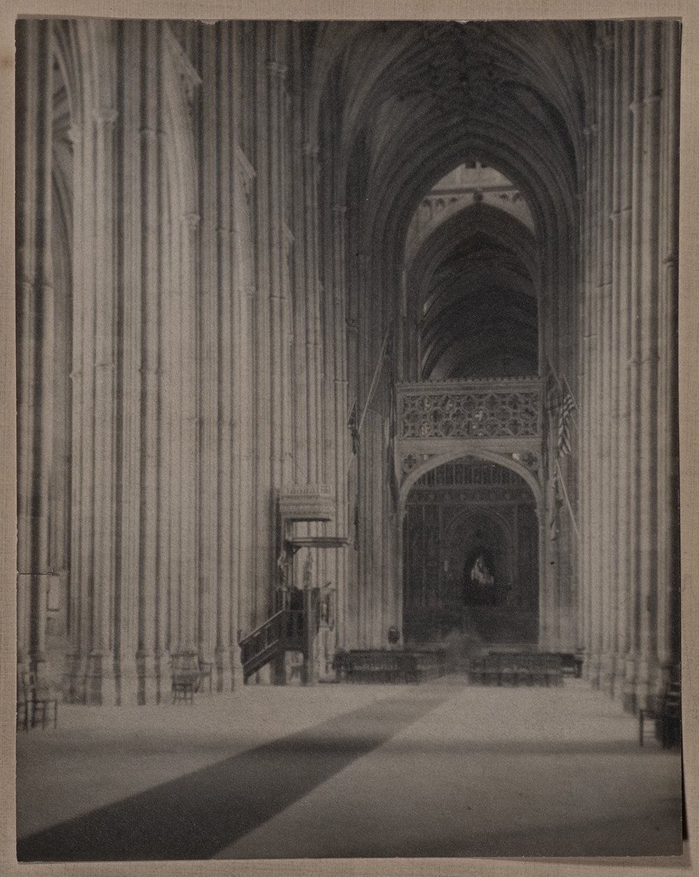
Alfred Brinkler, Untitled, n.d., Silver gelatin print, 6x4 inches, Gift of Portland Camera Club to the MMPA Collection
Libby (1881-1961) was both a professional artist and photographer. A graduate in fine arts from Princeton he started in photography early, winning an acceptance in the club’s annual salon at 19. He joined the club in 1906 and by 1908 was lecturing the members on composition. By 1922 he had an international reputation, and was one of the jurors in the prestigious London Salon. He was active in the group, Pictorial Photographers of America. However he dropped out of sight from the club in 1931, perhaps because of the fading of the Pictorialist movement, and did not reappear for 14 years, when he lectured on Kodachrome!. (Of all processes!)
The Plumb Family Donates Alfred Brinkler Prints to MMPA
This fall, Maine Museum of Photographic Arts received three beautiful exhibition quality gelatin silver prints to add to our Alfred Brinkler Collection. They were generously donated by Pam and Peter Plumb after hearing of the Portland Camera Club’s earlier gift of twenty-six prints and thirty rare paper negatives. We are so grateful for the privilege to care for these historic examples of late Pictorialist style photographs by such a talented Maine photographer and accomplished musician. Alfred Brinkler was a friend and colleague of Francis Orville Libby, whose artful technique in the gum bichromate process inspired Brinkler to apply the difficult process to his landscape photographs. Having these complimentary portfolios together in the MMPA collection will allow us to preserve and present their historic work for contemporary photographers to study in the context of the Pictorialist movement in the state of Maine.
Review of Alfred Brinkler photographs exhibited at the Salon International de Photography in Anvers, France in February 1927
by the Revue du Vrai et du Beau, Arts et Lettres
I must say that I am very occupied at the Salon International de Photography in Anvers, where some new arrivals appeared with the excellent and well deserved reputation of Alfred Brinkler. The works offer such value with both their style and execution, that I give them detailed examination and serious analysis. The two parts of my attention find completely in their favor. The Great Gulf, taken at Mount Washington, creates a superb impression of immensity and space; The New Moon and Nocturne in Madame’s Garden, provide an effect of darkness that is very successful, while The Wind, taken in color, contains a rich range of colors in the gray blues. A Day in Summer is enveloped in a bright luminosity, and La Gloire des Normands is an architectural motif taken from England by the artist during a recent voyage in Europe. Alfred Brinkler is, in effect, English by origin. He settled in the US around the age of twenty-four to cultivate there different arts, in particular music and photography, as he is the organist in a church. In his field, he is a member of the American Guild of Organists and the Association of the Royal College of Organists in England, which doesn’t keep him from being a member of the Salon of Photography in Pittsburg and the Society of Art in Portland. His work from the dark room has been shown this year in Pittsburg, New York, San Francisco, London, Glasgow, Toronto, Anvers, etc. He has won several grand prizes, among others at an international photo competition organized each year by the Boston periodical, “American Photography”. Pictorial photography is central for this artist. He has always been interested in it. But since the birth of his son, 7 years ago, he specializes in scenes of childhood and succeeds, in this field, with consummate experience and recognized authority. Alfred Brinkler works, generally with a procedure with gum bichromate for his larger work. First he takes the photo with a pocket camera. Then he develops it and retouches it like a veritable painting. It is a delicate process, gifted with a lot of taste and a sense of the setting. He obtains magnificent effects that have all the flavor a work of art and engaging, in addition, an impression that is alive with a rare intensity.
“When I first became interested in photography, I thought it was the whole cheese. My idea was to have it recognized as one of the fine arts. Today I don't give a hoot in hell about that. The mission of photography is to explain man to man and each man to himself.” — Edward Steichen
“I’m not telling you to make the world better, because I don’t think that progress is necessarily part of the package. I’m just telling you to live in it. Not just to endure it, not just to suffer it, not just to pass through it, but to live in it. To look at it. To try to get the picture. To live recklessly. To take chances. To make your own work and take pride in it. To seize the moment. And if you ask me why you should bother to do that, I could tell you that the grave’s a fine and private place, but none I think do there embrace. Nor do they sing there, or write, or argue, or see the tidal bore on the Amazon, or touch their children. And that’s what there is to do and get it while you can and good luck at it.” — Joan Didion from UC Riverside commencement address (1975)