Carol Eisenberg

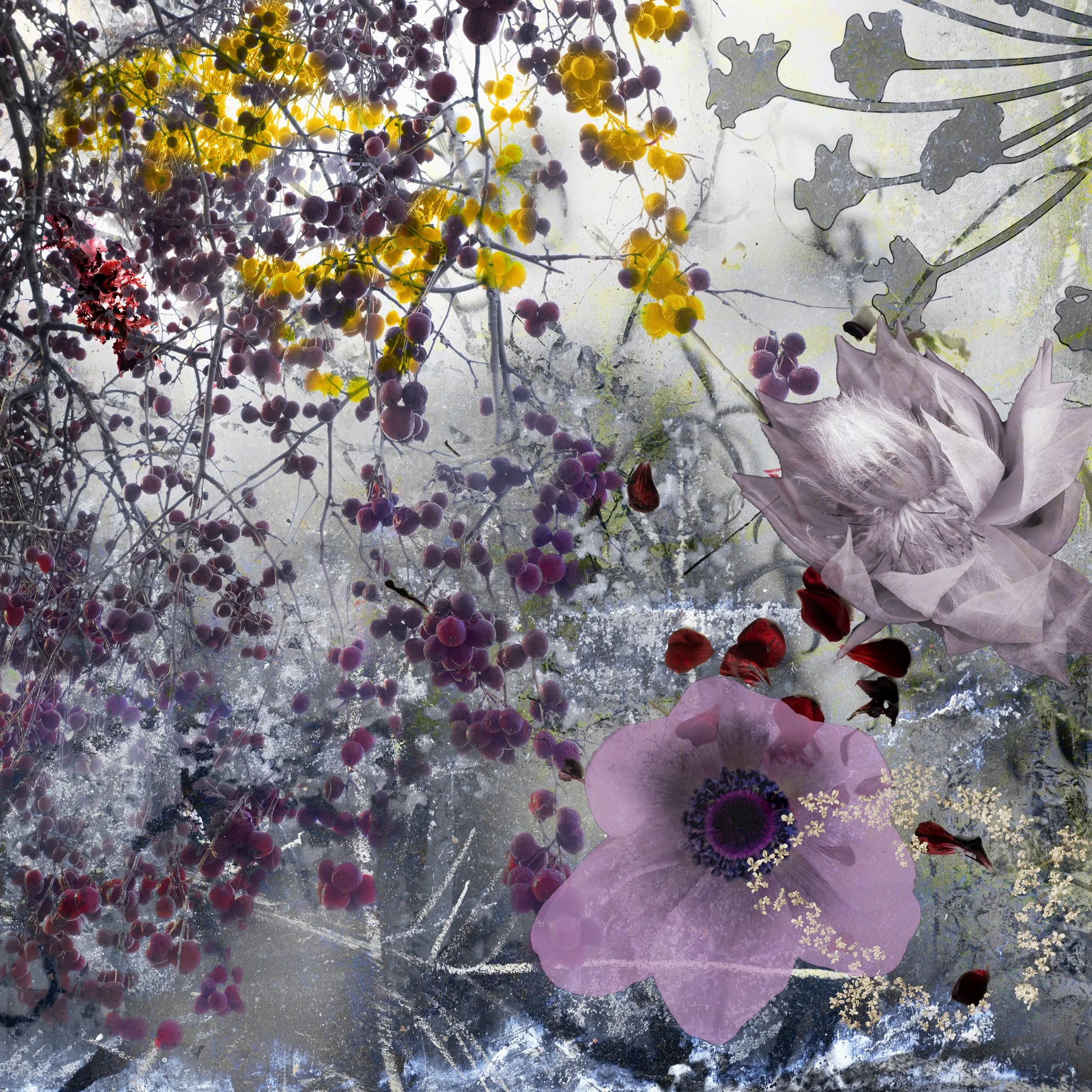
Carol Eisenberg, Flowers 09, From the series, Flowers on the Verge, 2020, Photo based digital construction, Dye sublimation print on aluminum, 40 x 40 inches. Purchase Print $3000
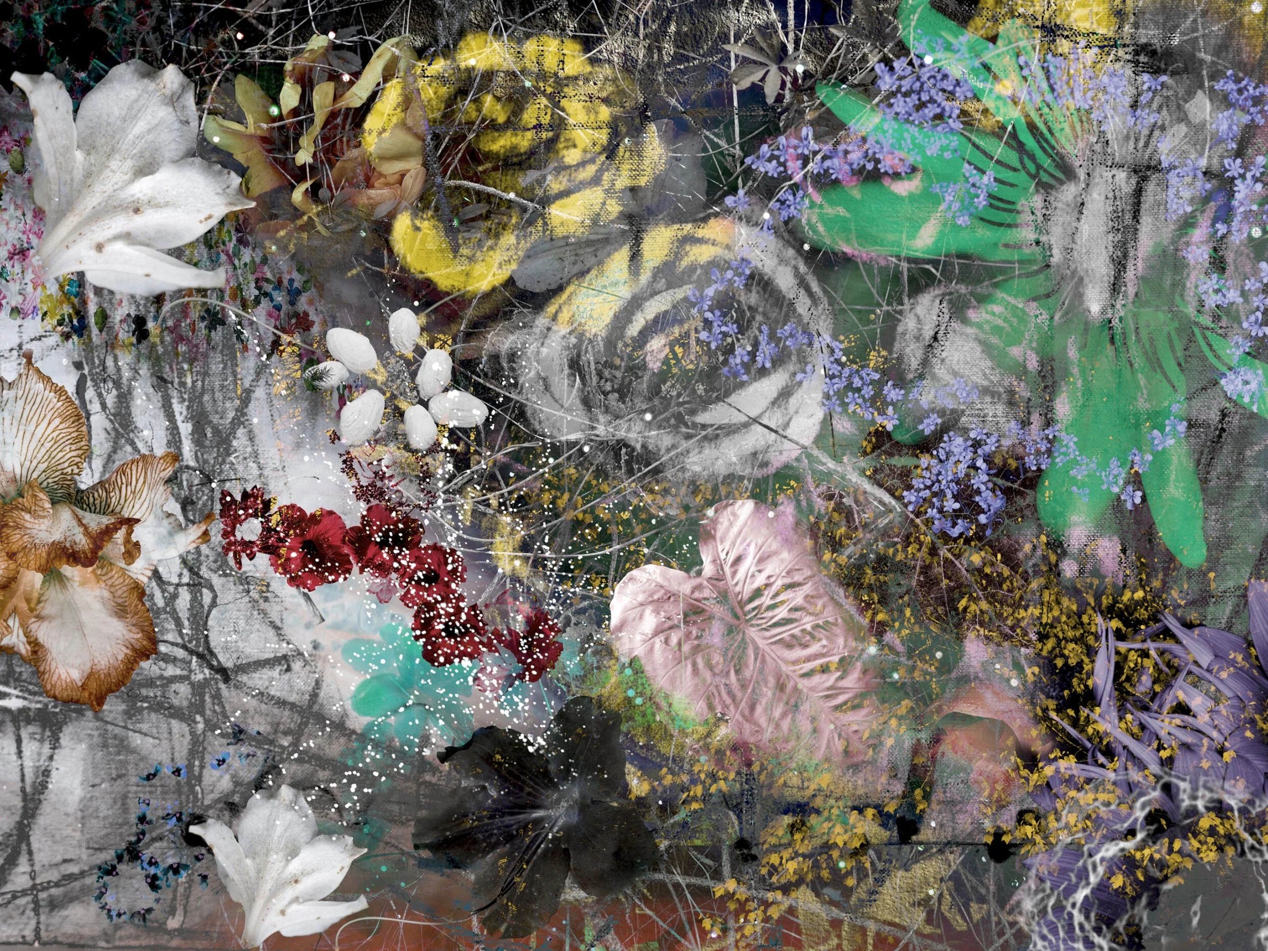
I create constructed digital images that blur the line between painting and photography. This duality of aesthetics is an essential component of my approach to art and life. I am drawn to the polarities of beauty and decay, the contrived and the natural, the excessive and the elegant.
All of my compositions begin with originally sourced imagery selected from photographs I shoot in my studio or on location in mid-coast Maine where I live half the year or my neighborhood and surroundings in Tel Aviv, Israel, where I reside the other half, as well as on my extensive travels here and abroad.
As an active participant in the feminist movement in the 1970s, the principles of inclusion, equality and justice underlie my work in the breadth of source material and the embrace of beauty in all its forms.


Carol Eisenberg has been a practicing photographer since the 1990s. She received her MFA in Media Studies and Photography from Maine Media Workshops + College, Rockport, ME. She specializes in creating digitally constructed images from originally sourced photographs she shoots in the studio and on location in Maine and Israel—where she resides—as well as on her extensive travels here and abroad.
Eisenberg’s work has been featured in Décor Maine, Maine Art Journal, Portland Press Herald, and Lenscratch, among others. In 2020, her work was the subject of solo exhibitions at the Maine Jewish Museum, Portland, ME, and Carver Hill Gallery, Camden, ME. Her work is in both public and private collections nationwide.
Images are original photo-based digital constructions printed on Hahnemuhle Photo Rag Metallic or by dye sublimation onto aluminum. Editions by size, 22.5 x 30 inches to 45 x 60 inches; custom sizes available.
Eisenberg is represented by the Carver Hill Gallery, Camden ME
Interview with Carol Eisenberg
by Jan Pieter van Voorst van Beest
Jan Pieter van Voorst van Beest managed to catch up with Carol for an interview while she was in the midst of an international move. Through this interview we see the influences of the world environment in the subtle lines and textures of Carol’s sublime portfolios of Flowers on the Verge and Undercurrents.
JPvVvB: From growing up in Dayton Ohio to graphic design, to women’s lib, to law school and then many years of practicing law in NYC, then Maine and Israel and finally to photography! That’s quite a journey! Tell us how it all ends up in the making of wonderful sort of semi- abstract and painterly photographs?
CE: It all adds up perfectly. From an early age, I was obsessed with fashion and beauty. I spent hours playing with Katie Keene cutouts (that really dates me doesn’t it?!) and my dream was to be a fashion illustrator. My plan was to obtain a liberal arts degree then move to NYC to attend F.I.T. or Pratt or Parsons.
Life, however, often has its own plans for you. After two years of college, I got married and found myself living in suburban NJ. By the age of 22, I was a mother. I completed my undergraduate degree at night and, when my son was old enough to go to nursery school, I found a job writing copy and designing promotional materials in the advertising department of a large east coast publishing company. When I was forced by company policy to leave this job I loved because I was pregnant with my second child, I joined N.O.W. and became passionately involved with the Women’s Movement. In 1972, I decided to go to back to school … but instead of art, I chose law. I practiced in New York for 36 years, retiring to Maine in 2009 with my late husband, our sailboat and our dog. Retirement also afforded us a chance to spend several months a year in Israel, where my step-son and two grandsons live. In Israel, I was deeply affected by my surroundings in ancient Jaffa, with its cobble stoned streets and its impossibly romantic ottoman style buildings with their peeling painted doors and shutters. I was also attracted to the industrial and emerging neighborhoods of Tel Aviv, which abound with graffiti, which I have always loved. And, of course, living in Israel also places me in the center of the Israeli Arab conflict.
If you look at my art carefully, it’s all there … layer upon layer. First and foremost, you notice the intense beauty (and often glamour) of the images. You can see how they tap into both the bucolic beauty of Maine and my love of fashion, design, and decoration. Then you notice the slash marks and the bruising, which intimate the feminine struggle and the political turmoil of our times. The slashes and mark making also tap into the lawyer part of me that rankles at injustice. Finally, you notice the graffiti, … which carries messages of rebellion and counterculture. These elements perfectly express the part of me that refuses to conform to to society’s notion of how women are supposed to behave … and maybe even the part of me that rebels against conventional notions of photography. There is also an element of the graffiti that speaks to my embrace of individuality and creativity.
In the final analysis, it is my process, which is one of layering and collage, that creates a visual expression of the many layers of my life.
JPvVvB: Looking at some of your work, it seems that your work has a greater influence from painting than from photography. I certainly see more Pollock, De Kooning or Appel than Adams or Weston. What artists do you consider to have influenced your style most?
CE: I had to address this same question in my MFA thesis and that’s when I first realized just about every artist who came to mind was a painter. In my high school art classes and college art history classes (in the 50’s and early 60’s) I was attracted to Matisse, Gaugin, Redon, Delaunay, and the like. Eventually I moved to the NY metropolitan area, which gave me access to a fortune’s worth of art galleries, museums and ‘’happenings’’ around the city. Thus, I had first-hand exposure to all the art movements of the second half of the last century as they were unfolding. Some of my favorite artists were Basquiat, Rosenquist, Frank Stella, David Salle, David Reed, Diebenkorn, Guston, etc. I later became attracted to the work of Cy Twombly, Sigmar Polke, Marlene Dumas, Tapies, Clemente, Ida Applebroog, Anselm Kiefer, Mary Heilman, Gerhard Richter and the like.
I paid scant attention to photography until I saw the work of Gilbert and George, Cindy Sherman, Nancy Skogland, Thomas Struth, Jeff Wall, Andreas Gursky, Tina Barney, Thomas Ruff, Annie Liebovitz and others who made very large prints … photographs that were like paintings in scale and color. As I became more knowledgeable, I came to appreciate the significance and beauty of classic photography.
JPvVvB: After living in NYC, Maine seems to slowly become a larger place in your life. You also spend a lot of time in Israel. How does the duality of dividing your time in two influence your work as an artist? How does it translate into your work?
CE: The look of the two places is very different – even in terms of nature because many of the plants, trees and flowers that exist in Israel are not found in Maine … and vice versa. And urban detritus, as is found in Tel Aviv, has no counterpart in Maine. Because I am so visual, I find myself stimulated anew when I switch locales.
JPvVvB: We detect other opposites in your work. There is trash versus beauty, optimism versus chaos and the decay of urban life versus the natural beauty of Maine. Do you feel that it is the energy of opposites that may give your work strength? Can you tell us why?
CE: Dualities are a key feature of my work … in both content and process. And I do believe that’s what gives the images energy and makes them interesting. My flowers, for example can be ravishing and wildly colorful or they can be dead or dying … or both. They can suggest fecundity and they can suggest decay, the contrived and/or the natural; the excessive and/or the elegant; the natural world and/or the made world.
Your question reminds me of conversations with my friend the art critic Claire Raymond. She points out that my images, while appearing ‘’textural and of the surface (a kind of feminist surfacism)’’ … are ‘’grounded by a mysterious, pervasive sense of depth.’’ She sees my work as simultaneously hopeful and mournful … sumptuous and somber … ‘’hinting at the beauty of the world as it leans on the verge of catastrophe.’’
Regarding my flower images in particular, Claire pointed to the ‘’tension between what vanishes and what persists’’ and labeled them ‘’feminist works precisely in their staging of persistence through recognition of transience.” From a feminist perspective in general, you can see how my images speak to the conflicting feelings I have (maybe all women have) about beauty. On the one hand, we’ve been told we must be beautiful according to certain standards. And from a young age, we are groomed to be obsessed with hair, weight, makeup, clothing, shoes, and jewelry. I really do enjoy everything having to do with aesthetics, fashion and make-up … yet there is this nagging awareness that an emphasis on superficial beauty is part of the objectification of women, which in the end damages them. These conflicted feelings create tension in the work.
While the depiction of natural beauty and the poetic tone of the flora and fauna contrast with the scrawl of graffiti and decay found on urban walls, their coexistence in my work also implies that in times of political, social and environmental strife, there is the possibility of reconciliation, hope and change. The layered imagery, soft veils of color, and abraded textures suggest the patina of age and the endurance of beauty in troubled times. They conjure a mythic, idyllic place where the ethereal beauties of the natural and made worlds co-exist in harmony.
JPvVvB: You have come to photographic art rather later in life. Do you feel having been primarily a photographer in the digital age (during which we see more and more “Photo Based Art vs straight photography) has forged your style into what we see today?
CE: I started shooting more than thirty years ago … before digital photography swept the world. Because I was primarily attracted to color, my film of choice was Fuji Velvia. As it was a slide film, I never edited any of my images after I shot them. I was practicing law when personal computers started to gain popularity. I embraced the new technology … even as most of my colleagues were clinging to dictation. Of course, I was using the pc strictly for word processing. Then I heard about Photoshop. My early efforts at using the program were quite crude and, like most photographers, I used it largely for editing. Finally, I could work in a (digital) darkroom. Gradually my skills improved and, during the time I was studying for my MFA, I began to appreciate the possibilities of using layers to create work. I quickly saw I could work the way a painter works, ‘’building’’ an image rather than ‘’finding’’ one.
So to answer your question, I think my gravitation to photo-based art has less to do with having become a photographer in the digital age and more about feeling myself to be a painter who uses photography. In this regard, every element of my images is something I have photographed … but I use the photographic fragments to make layered works that read like paintings.
JPvVvB: Following the progression in your work I detect a slow change in style (From the more detailed, more muted pieces in Xanadu to the bolder floral forms in the later(?) floral series, where do you see your art going and what determines your direction? What is next?
CE: The visual language hasn’t really changed insofar as it involves layering and collage, pastoral and urban imagery, contrasting textures etc. But the color palette and the ostensible subject matter seems to change depending on my response to what is going on in the world and in my life. Some of the earlier images to which you refer were created in the run up to the 2016 election and its aftermath. They are more than muted, they are pretty dark as was my mood at that time. The evolution to more colorful floral forms came about in response to the Covid pandemic. Being in lockdown stimulated a craving for something uplifting and beautiful. As winter gave way to spring in 2021, when it seemed the end of the pandemic might be in sight, many artists appeared to be drawn to floral imagery. Then came Omicron 1 and 2.
For me, the Undercurrents series speaks to this conflict between hope (that the pandemic would finally disappear) and the sinking feeling we were being pulled under again. Even the newer flower images with their sensational color palettes are marred and bruised. But they are a little less junked up with urban detritus.
As for what is next, I have no idea. My process is an intuitive one in that I don’t start with an idea but rather with some imagery that attracts my attention. I build the piece in a spontaneous manner. But at every step in the process I have to make a choice … and those decisions are an unconscious reflection of what’s going on inside my head. I spend a lot of time reading about and listening to the news … so it’s safe to say my thoughts will continue to be on the world situation and the immediate threat level of the pandemic. Accordingly, the imagery may get dark again or, in an act of defiance (maybe an attempt to assert control), it may get wilder and more colorful.