
William Baker Rand

William Baker Rand, Joint Checking, 2011, Oil on Canvas, 52 x 64 inches

photo by Alexey Gennedavich, William Rand and friends with Ava Gardner paintings, 2012 Spain
New Book:
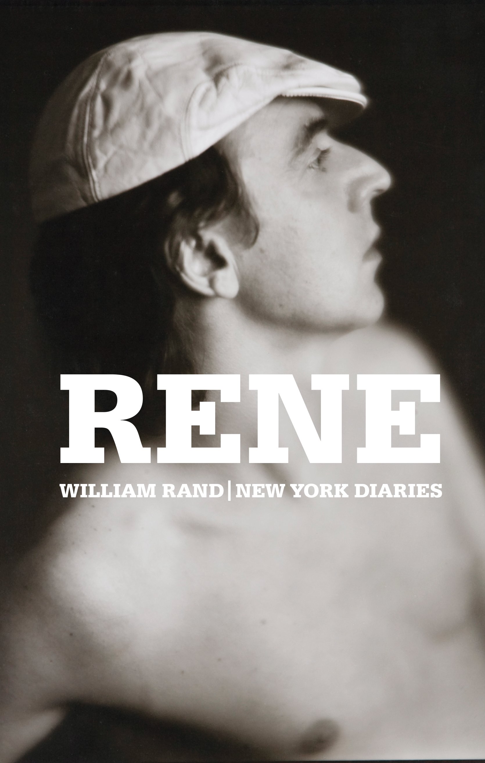
Rene | William Rand | New York Diaries
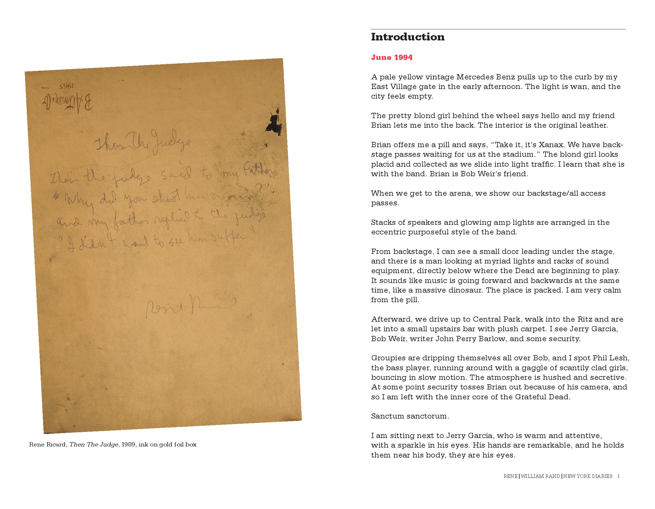
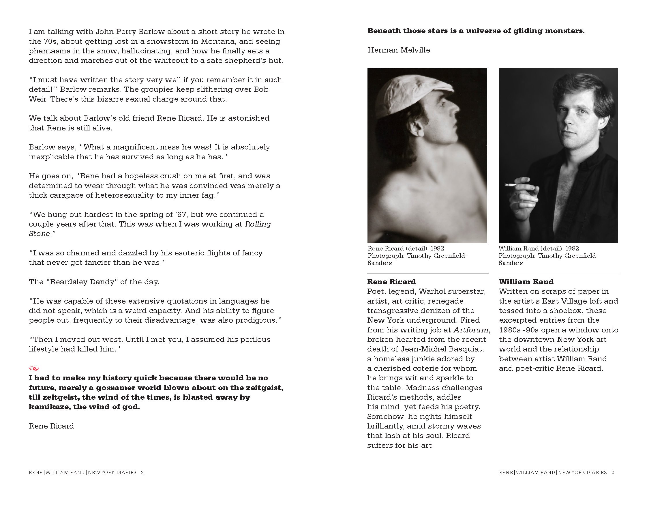
We are now far enough from these events that this diary has the effect of a time capsule. I’m struck by how very different the art world was back then. It is amazing how conservative things have gotten. I think people would be completely shunned today if they exhibited this type of behavior. Which, during those days, was practically considered normal.
Rene Ricard was one of those outrageous bohemian figures who had lived live on the edge every single day — like Gregory Corso or Bob Kaufman or Harry Smith. Nobody can tell the future, but I don’t think figures like that are going to come our way again, I’m not sure why, and I hope I am wrong, but it’s just a feeling I have. People were different back then, I think it had to do with the way they were brought up and the things they saw happening in the world, whether it was the atomic bomb, the beat era of the 1950s or the counter culture revolution of the 1960s. These were one time events never to be repeated. Even at the time I was aware how unique so many of these characters were, like Rene Ricard, William Burroughs, Allen Ginsberg. For me they were truly gods who walked the earth.
I think the method that William Rand used to document these events was brilliant: just write a few lines down on a sheet of paper and throw it into a shoe box. I think something people don’t always realize is, if you do a little every day, years later it adds up to a lot. The poet James Schuyler once said to me:” The important thing about keeping a diary is not to get upset if you miss a day or a week or even a month. It’s only when you start missing entire years that you should begin to be concerned.”
What I love about this diary is while it focuses on Rene, it gives the reader all sorts of details about the New York downtown scene: The restaurants and bars, the transvestite clubs, gallery openings, passersby and random street crime, etc. There’s also a marvelous cast of supporting characters: Taylor Mead, Dame Margo Howard-Howard, Andy Warhol and the now legendary episode of Ed Brezinski being rushed to the emergency room after eating a Robert Gober artwork.
Rand’s powers of observation and his literary skills are keen and subtle. Numerous times now I have read the book through in a single sitting. Having lived through this era, having known nearly all of those characters and even appearing in the dairy once or twice, I can attest to the accuracy of these events and descriptions, both in letter and in spirit. The combination of the minute and the momentous make for a riveting reading experience.
It’s hard to believe people lived this way and survived. (Well, some of them at least). I think one thing that readers should know is that Rene himself actually managed to get out of this vicious circle of addiction and trauma and homelessness, and went on to live another twenty years of a productive life as a painter and a poet. Which just goes to show, where there is life, there is hope. And despite his (at times) rather extreme personal transgressions, if Rene stood for anything, it was LIFE.
Let’s not forget that a large number of people valued Rene’s talent and responded to his intelligence and personal honesty, to the extent of taking him in for the night, paying for his meals, publishing his poems, giving him gallery shows, coming up with the excessive fees for poetry readings that he demanded (and deserved) etc. This book is testament to that sense of community. This was a family—a highly dysfunctional one, but then again, what family isn’t?
Stan Brakhage once said about the Harry Smith oral biography American Magus, it…was almost like being with Harry, and certainly a whole lot safer.” I feel that way about William Rand’s dairy.
— Raymond Foye
Writer, Editor, Curator, Publisher


WILLIAM RAND: TILES OF BABEL
By Peter Frank
William Rand is of a generation of American artists reared on images – on consuming them, on producing them, but not on controlling them. This so-called “Pictures” generation, sandwiched between the last world war and the emergence of digital technology, has never felt the agency that those who came before and after them have felt with regard to images. Previous generations gathered in movie theaters, took photographs, and bought picture magazines by choice, with only the occasional billboard or newspaper ad intruding into their visual space. Subsequent generations, by contrast, communicate with and absorb images as part of their sentience, choosing or rejecting pictures and their countless sources as readily, even willfully, as they order from restaurant menus or try on clothes. It is the Pictures generation that, even as it slouches towards superannuation, still struggles with the passive reception of images and what the most effective way might be of managing that reception and, indeed, those images – accepting them, denying them, altering them, mocking them, worshiping them. Pop art gave Pictures artists their cue, providing them a context for critique (albeit one whose nostalgic resonance the younger artists would have to divest). Taking further cue from the Situationists, Marshall McLuhan, and other information-as-spectacle theorists, Rand’s generation embraces and wrestles with images as elements of delirium.
“We are from the first television generation,” Rand observes of Pictures artists. “It was in black and white, like the illustrations of art in our books.” As a figurative artist – best known as a painter, but not limited to painting – Rand practically enslaves himself to images and to the notion of imagery as the basic substance of artmaking. But such enslavement, as Rand knows cunningly, is the most effective way of exercising control. If he is drunk on images, he is all the more in control of what images become in his mind and hands – the Bacchic power of the delirious over the delirium itself. For Rand, the typical artist’s scrapbook, of sketches, collages, and material gleaned from life and civilization, is more than a seedbed; it is a cultivated forest – and its growths and fruits, manifold and diverse, stand as well on their own as they do painted onto a canvas.
Rand’s image bank comprises a never-ending cascade of apparitions from myriad sources – high, low, fine-art, commercial, technical, romantic, graphic, obscure, universal, repellant, seductive, drawn, photographic, journalistic, domestic, exotic, and so forth. Rand deposits constantly into his image bank, but that process of selection – collection, really – is the minor part of his aesthetic and contextual authority. Rand exercises such authority principally by choosing from his bank, arranging and rearranging image-grids for his own painterly purposes and equally for the purpose of direct presentation as wall, and even room-sized installations, grids of square printouts herding so many cheek-by-jowl associations into the semblance of a narrative flow – a flow in many directions at once. Still calling them “studio notes” – “a personal journal of stray pages” — Rand describes their assembly as “art channel surfing… The variety of imagery from different centuries combin[ing] into narratives,” noting their “emotional content” as well as their formal qualities.
While the sources of his imagery may be so diverse, Rand traces his method – his format and his style – to the starkness of black and white photography and, conversely, to the fixity of the 12-inch square associated with the packaging of LP record albums. Album cover art, certainly in Rand’s youth, was hardly confined to black and white, but it locked some of the most elaborate and inspired pictorial design of modern times inside a structure as neutral as it was immutable. For their part, photographs appearing in publications were similarly confined if presented in pictorial and fashion magazines, but enjoyed a relatively slippery existence on the less rigidly designed pages of art magazines and, more importantly, newspapers, mainstream and alternate alike. The black-and-white pictorial documents whose ink rubbed off on your hands retained a simple graphic punch, popping up anywhere in The New York Times or your local rag, while gloriously colored art reproductions danced similarly across the pages of Art News and Artforum. All these publications were designed on the same planar grid of square units into which album covers fit so neatly; but while the album art crackled inside their rigid coops, the color-less pix illustrating news stories or quarter-page ad spreads played hopscotch, landing in very different places on page 4 than they did on page 2. In and among the myriad tiles of his appropriated-picture installations, Rand mediates between the instant, unpredictable imagery of periodicals and the sober squares of album-cover fantasy.
But he never breaks from what seems to be a vow of visual silence, or at least quietude. That is, for all the influence of album cover art on his work, Rand has restrained his palette (or at least that of his copiers and printers) to the gray scale. Color has been drained, or prohibited, from his image bank, and the one factor unifying pretty much every image-wall or image-room and all they contain is the black and white palette. In fact, this is close to true of anything Rand has produced as a mature artist.
He made his mark in New York as a painter of black-and-white forms and figures – painterly, to be sure, but shadowy and elusive, sepulchral and crepuscular, no matter how glorious or grim the subject.
As the late René Ricard wrote of Rand’s work, “…this oeuvre is a meditation on darkness, a painting in the shade.”
Such unstinting allegiance to the tonality of soot stems from a meeting late in the 1970s, while still an art student at the Portland (ME) School of Art, with Fluxus artist Albert M. Fine. Fine took one look at Rand’s painting and advised he stanch his palette and work only in black and white. This was the first of many “covert Fluxus lessons,” as Rand brands them, from the eccentric intermedialist who became mentor to the young artist as he entered the New York art world. In fact, Fluxus, originally coincident with Pop, provided many in Rand’s generation with alternate ways of responding to the image-glut around them. The preoccupation of Fluxus with mediated images, both as signs and as objects, permitted Rand and his contemporaries to grasp images as, potentially, agents in and of themselves – that the meaning of pictures is the responsibility not only of the artists who make (or, more to the point, find) them but the audiences that see them. Artistic authority is a matter of presentation at least as much as it is invention; how (two- and three-dimensional) images appropriated from vastly diverse sources are understood depends on a range of factors operating between artist and viewer. The artwork takes place in that range, making the viewer complicit in the work of art, according to Fluxus forerunner Marcel Duchamp.
It is a challenge to paint in the space between artist and viewer, and artists have long relied on their image banks to navigate that gulf. For the past century and a half, certainly going back to that moment in the 1880s when the camera was made technically and commercially available to non-professionals, artists have compiled image banks – as much with scissors as with lenses, but always with the sense that they were “taking notation” from the image-world around them. Fluxus practice, reductive and meditative even while antic and contrary, concentrates on that notation, encouraging artists to forge their own pictorial languages and allow multiple translations to occur in the space between them and their audience. Albert M. Fine pointed William Rand toward this kind of thinking, this reliance on the vagaries and broken strands of communication, a reliance that yields a continual, ever-changing stream of self-sustaining interpretation. It is a Babel-like condition, but one whose art is found in its very incoherence – and whose incoherence is mitigated and at the same time amplified by the artist’s sensibility. It is an embrace of pictures, true to Rand’s generation. In the expansive assemblies of image-tiles that comprise his installational work the elements of surprise, contradiction, academic and personal obscurity, and even satire collapse upon one another to yield a whole new structure, a structure where images mean neither what you, or Rand, want them to mean – nor do they mean anything else.
Los Angeles
July 2020
Les Affiches

William Baker Rand, Les Affiches, 2017 - 2019, Mixed media on wood


One of the earliest forms of advertisement which dates back many centuries, began to develop as a medium for visual communication and was popular in Paris. By the end of the nineteenth century, during an era known as the Belle Époque, the status of les affiches as a serious art form was raised even further. Intended to be seen on the street and more generally in public spaces, printed on paper, on fabric or synthetic supports. They have been crafted in variable dimensions and most commonly meant to be seen from a distance. The art form has spread around the world and become a staple of the graphic design trade. Many artists have created in this movement.
The images were used to promote various political parties, recruit soldiers, advertise products, spread ideas to the general public, and designed to be both eye-catching and informative. Even with the popularity of other forms of expression they are still being created every single day for all sorts of reasons.
L’esprit de resistance.
Les Affiches will remain an island of resistance both graphically and culturally and socio-politically.
William Baker Rand Interview
by Jan Pieter van Voorst van Beest
J.P. Congratulations on publishing your latest book, Rene | New York Diaries. Rene Ricard was a famous artist/ poet and art critic and had a large impact on the careers of many well known artists such as Julian Schnabel, Jean Michel Basquiat, and others. You worked with Ricard as well and had a close friendship with him. Would you describe his influence on your career and life?
W.R. Rene’s influence on my career was undoubtedly deleterious due to Rene’s violent reputation. I was never part of that go-go 80’s market.
Writing about the goings on in my studio in New York became a passion. Rene would say things in such an original way that if I did not write them down they would vanish into thin air.
Homeless, Rene was sleeping on the trains.
How do you hang out with an earthquake?
Taylor Mead introduced me to Billy Kluver and Julie Martin, authors of “Kiki’s Paris Artists and Lovers. 1900-1939” in the ‘90s in NY and their book opened my eyes to what I might accomplish.
Much of the material in Rene is so unconventional, that it took some time to return to the 80’s calmly. This is a tough milieu, it is my own season in hell.
Rene is such an elusive subject, the most elite art critic of our times. This is my safari.
Spain


William Baker Rand, Modular Ava Gardner, 2000 - 2003, Acrylic, oil, oil stick, varnish, Coca-Cola, coffee, red wine, salt, eyeliner, glitter, spray paint, dirt, pencil, etc., Each panel is 36 x 36 inches
J.P. During your Spanish years it seems your work gradually gets darker. The Ava Gardner modular mural seems to fit the narrative that you pursued at the time. Her ghost must have been present and felt at that time. Please tell us how you got to use her as a vehicle and symbol to describe the frustration and anxiety of those days.
W.R. The modular Ava Gardner is an assemblage of many 1 meter x 1 meter square painted canvases. Executed in my studio in Madrid, the work is the result of a collaboration with New York critic/poet Richard Milazzo from 1990 to 2001. Letters, poems, photos, drawings and telephone interviews criss-crossed the Atlantic between New York and Madrid before today’s facility of exchange with cell phones and internet. The mural, being modular, may be installed in any configuration. The research includes conversations with the concierge at the hotel Casteliana in Madrid and vintage Spanish movie magazines, old MGM stills and supporting material from the 1950’s.
I’ll also give you some of my thoughts on that project and those times:
March 2001, Madrid:
It was fair Ophelia who first sank into the dark waters
Of our modern minds
As the zenith of decadence: madness itself.
It was Ava Gardner, however, who glamorized her own free fall
Into the afterhours of Franco’s Spain,
Refusing to die young or go home early
News from the elderly Maitre’d, Castellana Hilton Hotel, Madrid:
“Ava Gardner was the most beautiful woman I have ever seen in my life. Her suite was number 256 on the interior patio of the hotel, a large lovely suite with a balcony. The orchestra played below and she would lean on the railing in her evening gown as the music wafted up…she could hear the fountains splashing. Ava used to jump up and down on the bed naked, running up and down the halls naked, drunk of course and very very beautiful, very happy. Sinatra did not break up her suite, although they fought. No Sinatra broke Uma Sumacs’s suite. They had a really bad row, over what I don’t know.
Ava Drives, 1999 WR
“I adore the nightlife” she sighs, pulling on a Chesterfield.
“That’s where the action is”
Screen Goddess, 2000 WR
After the triumph
They throw you in the trash
And if they don’t
You are stuck on the mantel
Like a couple of figurines
One starting adoringly
The other bored to death
I don’t remember when this all began
WR 2000
The word ROMANTIC breaks up like a ship on the rocky shores of Ava Gardner
New York

Richard Knapp, William Baker Rand Sweeping NYC Floor, 1995, Gelatin silver print, 16 x 20 inches


J.P. Over time the Debra figure seems to return consistently in your work. The Debra suite in your book, Four Decades is dated 1990 to 2016, which is a timespan including New York, Berlin, Spain and Maine. Can you tell us about the significance of this?
W.R. Two 10’ wide laser prints of the Debra Suite were printed on white rubberized fabric in 2016: edition 2. Hence the 2016 date.
Debra has been an institution in my work since the 90’s in New York.
We filmed Debra in 2016 during the filming of “Les Affiches”. The film posted at williambakerrand.com.
There is remarkable studio footage with Debra as well, pending post production.
Debra is a thrilling photographic subject. She appears in the new Rene book.
J.P. Since 2017 you are back in Maine after many decades. Of course you and your work have changed and evolved over time. Coming home to Maine, after 36 years, describe to us what it means to you to finally return and how would you think “being here” influences your work now and in the future?
W.R. Returning to Maine is such good timing for releasing my New York memoirs, since I really began here. One must look at life through the proper end of the telescope.
I am not someone who feels caressed by the sea, it is the rocks, a row of sturdy old oak trees, the frozen stream,
and the dark night steered by the stars.
William Baker Rand Four Decades
Essay by Rene Ricard

William Baker Rand, Four Decades, Published in 2018, Available at Printed Matter
Encompassing four decades of work, with poetry by Rand as well as essays penned by his close friends, the late critic Rene Ricard, and Suzette McAvoy, director and curator of the Center for Maine Contemporary Art. A marvelous raconteur, brilliant draftsman, and sharp-eyed, searing documentarian, Rand’s grand-scale black and white paintings chronicle his life and our times.
Drawn from eclectic sources–art history, geopolitics, literature, sports, nature, pop culture, current events–his imagery seduces with its intoxicating mix of beauty and decadence, highbrow and lowbrow. We want to be at this party.
Suzette McAvoy, Director,
Center for Maine Contemporary Art
View more about William Baker Rand at his web site williambakerrand.com